So this has been happening to me and maybe others ever since the new ui rolled out. No idea if it’s because of my monitor or display but I’ve been having this issue for a while and I thought I should mention it.
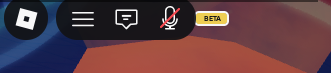
So as you can see from the screenshot bellow, the “BETA” label is being overlapped by the roblox UI partially, not too much but enough to make it seem irregular.
Note: Unsure if I should post this here and if it’s been reported before, I looked up “BETA” and nothing came out in the search results.
System Information:
Intel Core i5-9400
NVIDIA Geforce GTX 1050 Ti
Windows 11 Home
Expected behavior
“BETA” label is fully visible without anything obstructing it.