I am starting to work on a gift for a small clothing group and they have a neonish theme, so I decided to make them a mini-homestore. This is the base-build I need feedback on what I can add in general, (ex. chimney) The colors are definitely going to get a slight adjustment though.
Overall, your color scheme is nice. I like how the brightness isn’t gleaming to the eye, and it appeals. However, your build seems “flat”, or thin. I’d suggest making the walls thicker? I’d also use some darker tones for your windows, just because it’d go well, but that’s my preference. And, if you have an image of the Homestore you’re recreating, I’d like to see it for a better understanding.
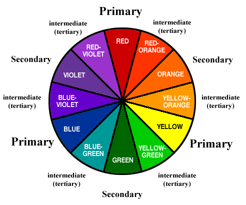
I suggest looking at a colour wheel if you wish to make edits to colour. It appears you want your colours to stick out and such; in which case I will highly suggest you to utilise complementary colours in contrast to harmonious colours to apply this to maximum effect. Again, refer back to the colour wheel to select the best colours for your rendition.
Size.
I understand that this is a “mini-home-store”, for (I assume) a group that possesses very little items for commerce. Though I believe even if so, an expansion would be nice.
Game Settings
Is the roof tall enough? Acknowledge the jump heights and such of average Roblox characters. At the moment, I assume if one were to jump inside your build, they would hit their head. To fix this, either make it taller or change the jump height itself.
Colours.
I understand that you will change the colours and I think you should do so; currently, the colours combinations are quite ugly (no offence to you) since they simply clash against each other -that shade of green and pink just don’t work well together- and do not benefit each other in ways such as complementary colours. Just constructive criticism for this and any future builds as colours are very important for first impressions and such.
Other than that, it looks quite good. Keep up the good work!
Honestly, it needs to be more modern if you wanted it to be neon themed. Try adding more white colours, make it bigger, try not to make it like a block, instead like a building.
About avatar height- You can move around in it just fine, you can jump and not hit your head.
As for the colors, I’m using their color scheme from their logo.


