Hello! I am just looking for some feedbacks on this graphic I made a few weeks ago. Feedbacks are extremely helpful for me, as they help me improve in th future.
Here is the graphic. 
Hello! I am just looking for some feedbacks on this graphic I made a few weeks ago. Feedbacks are extremely helpful for me, as they help me improve in th future.
Here is the graphic.
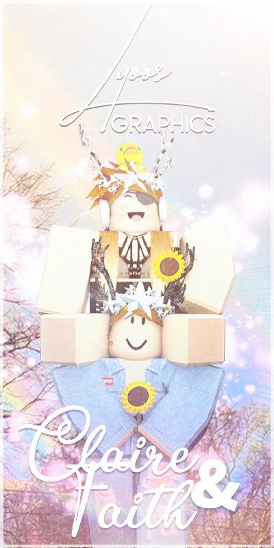
I think the text is hard to read not sure what this says.

It is so bright the arm and effects match making it hard to see the arm.

Although the render of the 2 characters looks fine.
Thank you! I’ll keep that in mind for future graphics. 
It’s hard to read, the text as the effects are too bright. A good contrast would be highly effective in making this graphic better.
The render of the characters are nice, but the arm bending could use some Smooth modifier in Blender
The piece is overwhelmingly bright, to the point that it hurts to look at too long since the dominant colour here is pure white. You can easily fix it by lowering the brightness and contrast.
Before:
Levels used:

After:
This would make point 2 almost obsolete.
The text is almost unreadable because of how bright the piece is, and how white the text is. I would add a slight gradient to the text to add some differentiation, or even recolour it entirely.
You can do that in multiple ways, one such being that you can select the text with the magic wand (or just go to the text layer if you have the psd/pdn file) and overlay a gradient.
It looks perfectly fine on first glance, but when you look at it, you realise that the trees and sky are low res, and its hard not to notice it after. I can’t really show you what it would look like since there’s only so much magic wand can select, but either blurring the background or choosing a higher resolution one would work much better.
The overall mood it gives off is upbeat and cheerful, which I’m guessing is what you were going for, so you went well there.
The render is fine; no posing problems aside from a few nitpicky things I would say about the top girl’s legs being perfectly straight around the bottom girl’s shoulder (i.e. they should bend downwards).
I hope my comments help with this and your future art!
It’s very bright and I can’t really read the text, I love the concept though!
Thank you! I’ll keep that in mind for future graphics.
Thank you! I’ll keep that in mind for future graphics.
Thank you so much for this very detailed Feedback! Definitely keeping this in mind.
I think this is awesome! Keep it up!
The edit is a definite improvement since you can see the characters’ outfits and expressions. The gradient also made the text intensely easier to read (plus it’s less bright). Overall great job with it!


