Hey everyone, a few months back I made a post about my game Speed Up and what I can improve in it. I’ve recently released a new update and I feel like it’s a lot better than before. Let me know what you think of the game in the comments below.
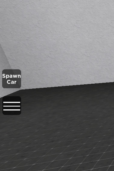
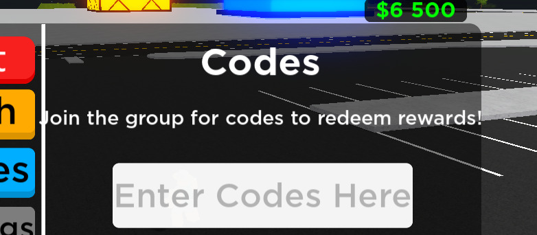
Here are some in game images of what the game looks like:
For those who are new and haven’t played this game yet, Speed Up is an open-world car driving game I made. There are a lot of areas like a runway where you can do drag races, a circuit race to race with, and a BIG hot wheels-themed track! You can purchase over 25+ cars. There’s also a limited car right now that will be off sale in 4 days, get it while you still can! The game might be laggy on lower-end devices since there’s a lot of content in the game.
TLDR:
It’s an open-world driving game with a lot of cars to unlock and a big map.
Let me know what you think of the game and what can be improved in order to make the game more fun! It is very much appreciated if you leave a thumbs up for the game.
TAKE NOTE THE GAME IS STILL A MASSIVE WORK IN PROGRESS AND IS STILL IN EARLY DEVELOPMENT!
Well you weren’t joking when you said it was laggy for lower end devices, on mobile it’s almost impossible to play and crashed Roblox for me (iPhone 11).
Instead of having the sign say “get cars here” I suggest changing it to “purchase cars” or make a button on the screen to buy cars from wherever you’re at. That way it’s easier so that players don’t have to travel all the way back to the dealership just to buy a car or paint it.
First joining the game, my device is already feeling like the sun because of how laggy the game is. Optimization or trying less blocks on the game is NEEDED.
The door fits me, but it is preferred to be bigger in order to prevent people from blocking the entrance.
The text on the sign is way too small and the unnecessary tiles is covering up unwanted space. The fonts could use a bit of change too.
In compliance with the picture above (No. 6), the background of the money could be transparent or a bit lower opacity because it doesn’t match that well.
over all, this is a good game but way too early in development to say anything else. good luck and don’t give up!