Hey Devs!
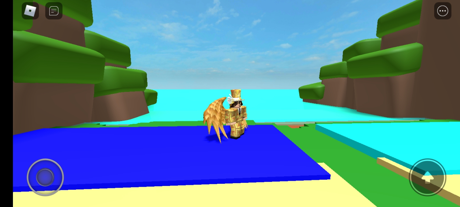
I have worked on the start of a simulator map today, and I would like to see what people think. I take critisizm as a good thing. I’m always looking to improve my building. Please note, that the lobby is no where near finished, and have colored cubes for houses and things that I will build in the future! Please also forgive me, as these photos are screenshots from my phone, as im out while posting this, and havent got access to my pc.

3 Likes
Looks unfinished to me, the brown border doesnt stretch all around the sand
And the random colors dont fit in that much
6/10
1 Like
It need sto be a lot morw detailed. I understand the cartoony simulator theme but like drip said it just seems unifinished. Add a texture to the ocean, and maybe some cartoony decor.
4/10
But i suggest post it again when your finnished
1 Like
I agree. It’s a good start but like the fine developers said below there is still a lot of open area and the color scheme doesn’t match. Try to fill the map as much as you can or make it smaller. Overall the low poly mountains looks good but make sure If you want lo poly you stay low poly themed. That’s that most mistake I’ve seen in my time as developers assistants whatever is mixing of themes. You can but it’s hard to make them look good together.
Over all I would rate a 5.5
1 Like
I would rate it a 2.5/10. I have been building for 7 years. And I can tell you that this map does need help. The borders look too bland, so do the path, bushes, and etc. I would suggest using blender more. I can see that the border are made in blender but you just got a meatball part from blender and imported it into ROBLOX studio and stretched it and built it. This can use a lot of work. I am not trying to be harsh here, I am trying to give you feedback.
1 Like
It looks decent, but needs a lot more detail put into this lobby.
The grass needs some sort of texture and the bushes look too basic. 4/10
1 Like
Thanks for the reply! It is currently unfinished, thats why it looks it. I just wanted to have some feedback before I finished the build so I can make changes easier. 
I understand, thtnk you for your help! 
you could use some extra lighting effects and materials to add a bit more because right now it looks quite plain. 7.5/10