My first attempt in advertisements!

Hello!

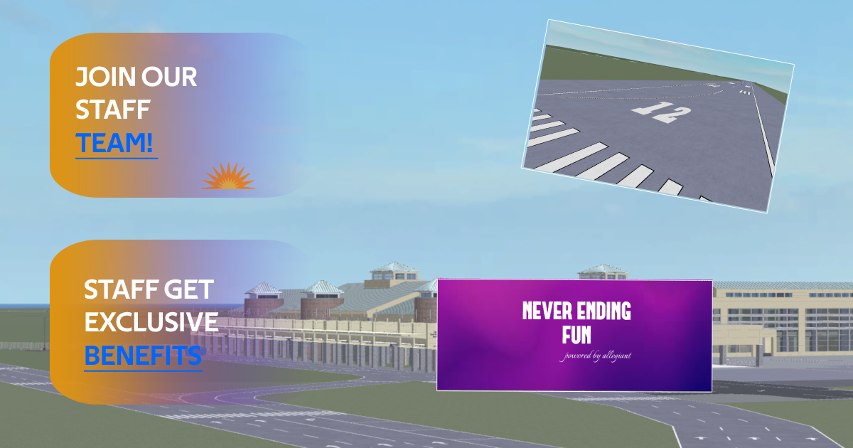
I’ve been into GFX designs lately and I’ve made my first take in the Graphics Design industry using Photopea. In my opinion, this looks better than what I had expected for it to be. Let me know how it looks! (For the left logo, I used a Photopea Emoji but everything else is hand made)

energia

5 Likes

★ My Rating ★


Love the purple and the font, the word “ENERGIA” reminds me of magenta so very well done. I give this an 8.5/10.

My Suggestions for that 10/10

[•] I suggest adding a shadow to the text or remove the shadow from the orbs in the background.

[•] Change the color of the orbs slighting more bright or a different color.

1 Like

either a shadow or an outline for the text would make it better

1 Like

Thank you! I will definitely consider this.

For a first, it’s quite good. However, I do have a few suggestions. The text is very flat, there’s no depth to it. You should try adding outlines, shadows, and gradients to the text. Also, the background is pretty boring, it looks more like something you would see on a banner rather than an advertisement.

This looks good as it is, definitely not great.

The logo on the left side should be a bit smaller, to make space between the white line and the weird thing on the bottom.

The “Energia” is fine as it is, just add more space in it like the text below.

The “Innovation at the best” is wrong grammar, fix that and make it a bit smaller, just a tad bit.

2 Likes

Yeah, I would say that these advertisements are pretty eye-catching.

1 Like

Yes, I would also say the same thing, but he did a good job.

2 Likes

If I see this ad on Roblox, my brain will say “CLICK!!! NOW!!”

Serious feedback

200/10, your ad is amazingly cool!

1 Like

Thank you! I’ve recently created a new graphic for my group and I believe it came out quite good actually. Here is a copy of it.

1 Like

In my opinion, it looks simple and nice. I really like flat text.
Outlined or shadowed text don’t really fit for me.

1 Like