Welcome to The Guide to UI Designing 
Hello, future UI Designers, welcome to this Guide to UI Designing.
Have you ever wondered where to start UI Designing? Are you struggling to get to grips with the basics? Well, this is the right introduction for you!
Reference Guide
- Colour Contrast
- Colour Theme
- Colour Gradients
- Key Elements of good UI
- Tips and Tricks
- Software Recommendations
- Importing and Scaling UI
- Tips and suggestions by Users
Colour Contrast
Let’s start with the basics of UI. First of all, you need to know which colours contrast better and which colours can make your eyes hurt.
I will introduce you to a friend of mine, the colour wheel. This is a guide I use to see which colours contrast well. These colours are called complementary colours.
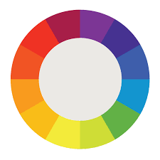
Can you see the colours opposite each other, they are the colours that contrast well. If I was to write all the contrasting colours in a list it would be like this
- Red and Green
- Orange and Blue
- Peach and Purple
- Yellow and Violet
- Light Green and Dark Red
However, some of these colours can cause eye strain. This is very important when talking about UI Design.
Black and Yellow
These are the colours that cause the most eye strain, especially when looking at a small monitor or screen. I can not bear looking at them and neither can you.
White and Black
These two colours are one of the, if not the best, contrasting colours. They are commonly used in User Interface as well.
Blue, Black and White

The colours shown here contrast well as they do not make your eyes hurt a lot. You get the idea.
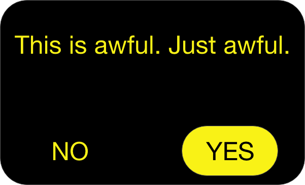
Colour Theme
Now, some colours can look good together and some look terrible.

Image source User interface: good design vs bad design - h2o digital
This is an example of bad UI. There is a lot of colours going on which makes the UI look overcrowded and ugly. This is why you should never use too many colours

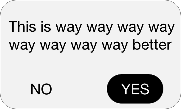
Image source - 26 Best Interactive UI Design Examples for Your Inspiration in 2019 | by Trista liu | Medium
The UI above looks and feels great. It has 2 main colours (blue and white), which means that the UI is not too overcrowded.
Colour Gradient
To make your UI more exciting and interesting there is a useful technique called Gradient. You can do this either on a software or on Roblox Studio. For this purpose, I will use ROBLOX Studio
First, you need to open ROBLOX Studio. It should come with the normal Roblox app when it was downloaded. If not, download it by going to the create tab on your normal Roblox home page. After that, you should open it and create a new place (preferably flat). Once you are inside you need to enable explorer and properties in the view panel.

Once you have done, that create a ScreenGUI inside the StarterGUI folder.

After that, create a frame inside the ScreenGUI.

Drag the frame towards the middle and make it wider so it looks more like a rectangle.

Insert a UI Gradient inside the frame.

Now let’s make the gradient. Go to the colour on the properties panel and click on it. On the side, there will be 3 dots. Click on them. You will see a Gradient panel.

Do you notice when you drag the mouse on the white rectangle you see a line? Well, place to more in the middle equally spaced. Then press the colour box on the panel. For the single triangle at the bottom of the rectangle highlighted in yellow, You need to select a dark colour. I went with dark blue. For the other small triangles change the darkness, until you reach a pale blue

Close the menu and Well Done!. You have created your first Gradient. Try experimenting with by using different colours of your choice.

Key features of good UI
Here I would be taking you through each key feature of making a good UI. During my time as a UI Designer, I made something called the 4 C’s. If you want to make a high-quality UI, try and keep this in mind.
-
Consistent - You need to use the same layout for the same UI
-
Clear - For the user to understand your UI, you need to be clear.
-
Concise - You need to keep to the point and not overcomplicate your work
-
Coherent - The user must need to know where they need to go in your UI to get something.
I always use this rule in my UI and it helps a lot. I hope it helps you, too!
Tips and Tricks
What fun is making a UI if you don’t know the shortcuts and tricks?
Tip number 1
If you want to save time when doing your work you need to know this neat trick. Once you have completed your first design, you can duplicate (Control + D or Command + D ) it again, instead of making the whole thing again.
Tip number 2
This is the lifesaver of making UI. You should roundify your buttons and frames, to get a neat look. I do not like square buttons as they look too blocky and not aesthetically pleasing.
Tip number 3
Use the 4 C’s. You probably should have read it or seen it in the section above. It is very useful in terms of creating a great UI.
Tip number 4
Some colours can reflect moods and emotions such as:
- Red - Anger
- Blue - Clam
- Yellow - Joy
- Purple - Pride
- Pink - Romance
- Black - Fear
These colours and emotions might come useful one day.
Tip Number 5
Try and make your UI relate to the game you or someone else is trying to make. This will help the user understand more about what the game is about.
Software Recommendations
You can not create a high-quality UI without a software. Here I will talk about beginner Softwares (Free and non-free) and Professional Softwares (Again, free and non-free).
Adobe XD
This is a great free beginners software. I know this myself as I used it when I started making UI. Below I have attached something I made on that program.

Pros
- Can create great UI
- Easy to use
- Easy to learn
Cons
- You can not make realistic UI
- Limited amount of storage
Gimp
This is the next best software for beginners. I personally have not tried it out but from extensive searching, I wanted to recommend this.

Image source - Download GIMP for Mac | MacUpdate
Pros
- Good use of layering
- Similar to Photoshop
- Greate range of tools
Cons
- Learning this can take time
- Limited options to make 3D Designs
Adobe Photoshop (£9.98 or 9.99USD)
This one of the best not-for-free Softwares I know of. I use this software now and you can create great UI.
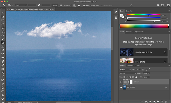
Image source - https://blogs.adobe.com/jkost/2019/02/different-default-workspace-in-photoshop-cc.html
Pros
- Can create any type of UI
- A range of tools
- Great quality
Cons
- Does not include vector support
- Takes time to learn
Adobe Illustrator (£19.98 or 19.99USD)
This is another software that can create the best quality images. It uses vector, to make the quality of your UI better than Photoshop’s

Image source - https://blogs.adobe.com/adobeillustrator/tag/design
Pros
- Vector Support
- A variety of tools
- It can handle most file types
Cons
- Takes time to learn
- Pricey
Importing and Scaling UI
You have created your UI and you want to put it in Roblox Studio. But How? I have shown you a step by step guide to successfully import and scale UI.
You have your finished UI. I created an example below

First, you need to separate the interactive from the non-interactive (the button from the mainframe) like so.

I have left the text out as it the quality of it would be bad if you import it. Instead, I do it in Roblox Studio. Save the button and the frame and button separately as PNG files.
Open Roblox Studio and go to your desired place. Make sure the explorer and properties panel are on under the view tab.
Insert a ScreenGui inside StarterGui

Then insert a Frame inside ScreenGui and set the background transparency to 1 in the Properties Panel.

After that insert a UIAspectRatioConstraint inside the Frame like so.

Next, you can insert an Image Label inside Frame. You will need to move the frame to the middle and resize it.

Go to the image label and scroll down on the properties panel until you found the Image option. Click on that and press add image. Select your UI mainframe in your files and press create. You now have your Mainframe.

You have this ugly background. Get rid of it by setting the background transparency to 1 in the properties panel. Your UI should have a clear background. If not, make sure you have saved the image as a PNG file.

Now you need to upload the button. Follow the same steps I used to import the mainframe, but put the Image Label under the Image Label, like so.

Now you need to add the text. Insert 2 TextButtons, one over the image label, one next to the circle. Rename them to what you want. Make sure you enable TextScaled in the properties panel and set Background Transparency to 1. You can change the colour and font of the text if needed. The finished result should be like this.

You need to check if your UI Design is overstretching or looking a bit weird. You can check this by going to the small iPhone and iPad icon on the top right of the screen. You can pick any device and see how your UI looks there.

Well done you have successfully Imported and Scaled your UI.
Tips and Suggestions by Users
“Another recommendation is to always use the Device Test feature (Use something like Average Laptop with the Fit to Window setting active) it helps you scale UIs correctly.”
“I would like to add that sizing Guis with the Scale is suggested since the Scale resizes with the screen’s size and not with pixels which the offset does.”
“If you can’t spend a monthly subscription fee on Adobe Illustrator, I recommend Affinity Designer . It’s a Vector design software like Illustrator but comes at a one time purchase and is often on sale. Right now it’s on sale for 50% and is $35 CAD. Designer covers almost every single feature of illustrator and even brings some new ones to the table. If you’re looking to learn how to use it, I would recommend this tutorial that covers basically all the features of Designer.”
“One quick comment adobe isn’t free it, in fact, costs a lot for an app just a quick note so not everyone can use adobe.”
Well, you have reached the end of this Guide. I am proud that you lasted this long. I hope this will help in any of your future projects! Bye