Clearly, I’m not the best at building; I want to improve. Please provide critical feedback. If I don’t respond to you, it doesn’t necessarily mean I ignored your feedback.
Game Link:


Reference:
Clearly, I’m not the best at building; I want to improve. Please provide critical feedback. If I don’t respond to you, it doesn’t necessarily mean I ignored your feedback.
Game Link:
Reference:
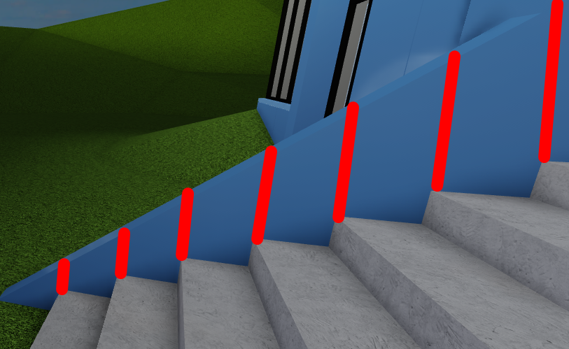
When doing something in Roblox (especially buildings) you need to make sure they’re NPC compatible. What does that mean? It means that builds should be proportional to our character. It would be a different story if there was a slope (like in the reference).
What I recommend is putting an inner layer of parts inside so that you’d be able to change the wall color inside.
Other than that, I don’t think that there’s something else to change, taking that this is still a work in progress. Keep it up!
I like it! Though it does look a bit too flat. Especially the right wall. Could use more texture, along with a point of interest near the entrance to draw people in.
Lighting is also a concern with how transparent the windows are. Usually in games you have more vibrant colors inside to draw the players towards the action. Having more shading would allow for greater chances to place mood lighting.
I can’t figure out how to access the third floor, so I can’t really say anything on that. If you add a ramp up to that floor, I’d be happy to check it out again and update my critique.
Also, do you just want a critique of the building itself or also the surroundings?
To fill that wall, he would need a lot of the logos, unless he places a big huge one, that might look messed up.
I think you should use the brick material instead of plastic on the white walls. It would look better in my opinion. Also, try to add some bushes aswell as a path next to the stairs and the door. Something like this:
Good luck!
You would’ve been better off replicating the building design entirely instead of trying to parody it.
Slopped landscapes need a similar architecture design to match it which isn’t the easiest to accomplish. The architect behind the reference photo clearly knew a flat landscape complimented their architecture design nicely.
Now here’s a question that you must ask yourself:
Can you replicate the reference? I’m not trying to call you out however if you want to improve yourself than constructive criticism is a necessity. Especially in rare cases like this where it’s being flooded with compliments.
Ramps is the lazy mans substitute to stairs, elevators would’ve been a more reasonable alternative.
Here’s my personal tips that sounds simple yet realistically it isn’t:
Not posting until you’re confident it’s presentable, It took me awhile to get a grip of “Just because I invested x amount of time into this doesn’t mean I should post it”
Resisting the natural urge to rush a build, rushing can nearly kill the original vision behind it. Trust me when I say this… it never works out in your favor, everyone builds at their own pace.
Justifying your rushing or lack of detail as “I’m not being paid for this so it doesn’t matter” or “This is just Roblox, no reason to be serious about this”. Justifying laziness puts you into this quantity state of mind that isn’t the easiest to rid yourself of.
You’ve got potential @Inspirre, I’m looking forward to your renovation.
Other issues:
I know it’s generally frowned upon to replicate other people’s comments but @PurpSinister raises an excellent point that the general style of architecture employed within this build looks flimsy and incoherent in consideration of its environment. I don’t think I’ve ever seen an office building situated within the rolling hills, and as such it’s very difficult to picture this build with any degree of seriousness. I’m not sure if many other people feel that way, but as a realist (in terms of my own building style, in which I try to make it seem as realistic as possible), it’s good to convince the player that what they are seeing could be real, rather than simply building something you’ve seen and fitting it into a synthetic environment.
Most people here have said that it looks great so far but I have to disagree. It’s fairly plain and basic and, in my opinion, not well put together. That isn’t to say that the build itself is poor – only that you haven’t properly considered all the variables required to make a convincing creation. The best way to fix this is is probably to build something more original than what you’ve already done: to consider a building that would best match its environment, to consider lighting to a more substantial degree, and to build from your personal inspiration rather than a secondary source, as that will inevitably come across as more sincere than any other method.
Edit: Gave more substance to my critique.
The real life building Dosent have a big white stand on the side of it.