Hello, it’s hoosmany, wanted to share some UI’S i made today what do ya’ll think,
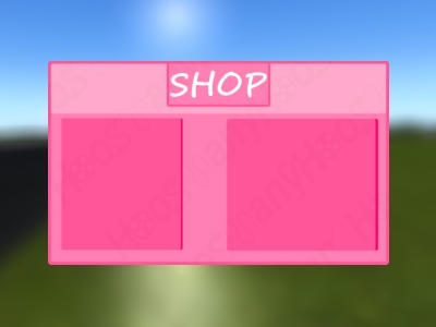
What are your opinions, feedback is appreciated,
Don’t judge that there is only 2, I wanted to see how these are, 
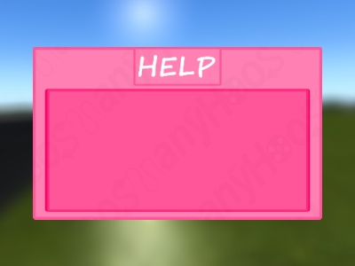
Hello, it’s hoosmany, wanted to share some UI’S i made today what do ya’ll think,
What are your opinions, feedback is appreciated,
Don’t judge that there is only 2, I wanted to see how these are,
You should change the font, remove the border/color around ‘Shop’ and move the two blocks together more. The color scheme could be better, than a bright pink. Try using this to see what colors work!

@loertis That a posed to be like on the left side is the buying item, right side where you click the items to buy it
I’d suggest making the text a little smaller to leave a little margin between it and the box, because right now it is too close to it.
Other than that, I like your UI Design so far.
There isn’t really alot to go off from, add more content to it so we can judge/give our opinions on it better. Anyways, for the current design, the “SHOP” topbar seems a little off to me. Making is smaller while removing the border and background on the title would make it look more clean. Adding a dropshadow to the topbar might make it pop out as well.
The bottom UI design “HELP” also has a weird title effect, removing the border around it and making it smaller will give you more space to work with. You should probably make it consistent with the shop as well since the shop has a dropshadow effect whereas your help menu has a border around it. Otherwise pretty good.
 Keep adding onto it and some spice to make it pop out more.
I think changing the background to white will be better since it will open you up to a large amount of possibilities in terms of button colors. Right now very few color choices would go well with a pink background. So overall, not only the looks would be improved, but also the readability and it would be a little easy on user’s eyes.
Oh, at least make the gap in the middle a little smaller.
Gotcha! Will do thanks for the feedback
The UI is a decent start but there is some room for improvement.
They look pretty good but I don’t think the top of this UI should have a lighter pink. It just doesn’t look that appealing to me.
I also thing the textbox’s background and outline should be invisible as I think it will improve the UI a lot!
It’s a decent UI and I wish you good luck on your future projects!
I would try the GothamBlock font.
I like it but it needs a new font.
@Inserted_Cring3 @chenami & @RecBtw
Thank y’all for the feedback it is appreciated,
Will be out in to play,