Feedback on my first Logo

Hello!

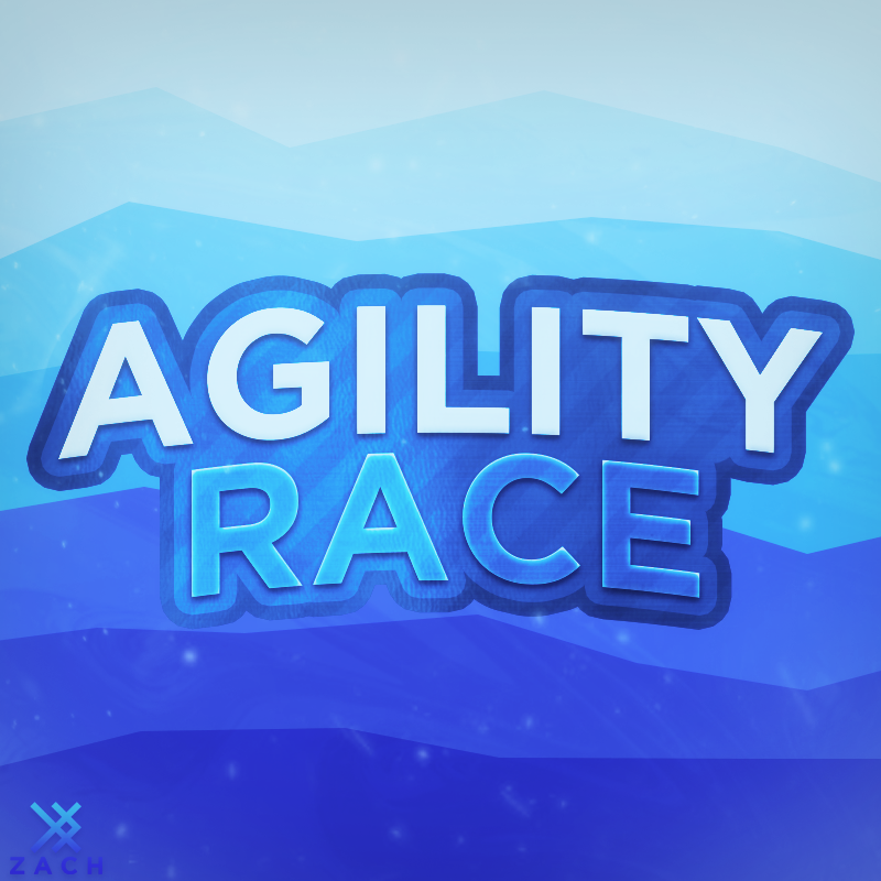
I did graphics in PhotoShop for fun for 2 years. Suddenly I was reminded that I am a member of the Roblox Developer Forum. This is my first attempt to make a Logo.

What do you think about it and what could I possibly improve or change?

I was inspired by Zach:

12 Likes

Looks pretty good. I wouldn’t use it on a blue background because thats too much blue but for a first logo it is very nice.

1 Like

It looks good, Though you could add a better background and maybe Decrease the amount of Strokes you have used. :slight_smile: Great logo anyways! :+1:

1 Like

I love the typography! It gives off an excellent cartoon look. However, I do feel like you can improve the spacing between letters so they don’t feel all so scrunched up together. You’ve given the logo a much more appealing look than the original, keep up the good work!

1 Like

Thank you everyone for a feedback :slight_smile:

Looks really nice but like @C0_le said the blue background doesn’t look that nice. Maybe making the background white could improve this.

Well done, this is a great first logo :+1::slightly_smiling_face:

1 Like

Love the way you did the text :slight_smile:

2 Likes

I think the text looks amazing! I’d recommend not using the solid blue background. If this is for a game, you could use a game scene perhaps for the background. It looks great, nice job!

1 Like

If you really want to use a blue background, tone the color down.

2 Likes

I love it! What font is that, e.e. I love all the colors on the text they all blend in very well. I personally think it is amazing overall, and for the background if you want to learn how I did, I suggest searching up TGv1 Background Tutorial Roblox on Youtube. It should come up. I love and I hope you go very far with these amazing graphics.

1 Like

This font is called Plumpfull. Thank you for the feedback :slight_smile:

Love the text but the blue background is wayy too agressive! You’ve done a very good job on the text though. Good work! :slight_smile:

2 Likes

Thank you for the feedback :))

2 Likes

Wow! For your first logo, it looks amazing! I love it! :heart::heart::heart:

1 Like

Like the logo it’s really nice I myself am also a logo designer, but I like it looks great the background blue and the text being blue makes its not to good you should make the blue background a little darker just a little, other than that I like your logo looks amazing.

1 Like

Like a lot of people have said, I would change the background to a picture or part of the game. The text is very well done, good job!

1 Like

thanks :slight_smile:

30Charrrrrrrrrrrrrrr

Another thing I would recommend reading this guide to learn how to make your text even more detailed.

1 Like

The font looks good, I like it. But make the background transparent and add it onto another image, overall looks great.

1 Like