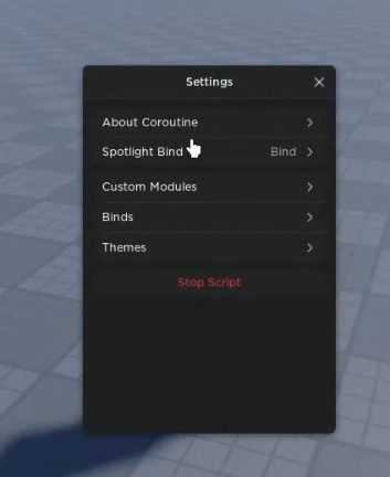

But, I’m a rookie at making ui?
Any tips on how I would do this?
Try watching Youtube videos about making cool roblox UI’S. I recommend watching around 3-4 different videos on Youtube.
Any suggestions on which ones I should watch?
I keep on getting the basic how to make roblox gui tutorials.
Links here :
– Here he explains half of the course for UI’S.
– UI’S ideas here and techniques.
– How to make settings UI’S !
Hope it helped you out!
I don’t happen to have alot of experience with photoshop nor do I own it.
But, I think this is a image with the sliced scaling feature?

As mentioned I have some experience with ui but not too much.
I think its 2 frames parented to a screengui and when players click the button they make both frames appears.
The first image and somewhat the second, can be made almost entirely within studio by using UICorners to replicate the rounding effect, UIStrokes to create borders around the rounded UI, and the BackgroundTransparency property within pretty much any UI element to set the transparency of the UI.
Creating UI Elements That Aren't Possible Within Roblox Studio.
As for the Search Icon (![]() ) and heading bar
) and heading bar
(![]() ), you’ll need to use an external program the create these.
), you’ll need to use an external program the create these.
lookLOLtrelakor has created an in-depth tutorial for creating great UIs and shares some websites they use to find icons. This should take care of that search icon.
Now onto the heading bar I mentioned.
Once the CanvasGroup Beta becomes available to users beyond studio, you will not need to go off studio for creating something like this but until then, you will.
Figma is available as a desktop app and website for free to create UI and i’ll use it to guide you on creating the heading bar. Before I start i’ll assume you have already created an account and have created a new design file and are open to a screen that looks a bit like
Heading Bar Tutorial
Figma
- Press R, press down, drag your cursor across the screen to create a rectangle, and release.
- Use the panel on the right side of your screen to adjust the height and width to 1024x1024 for the largest resolution when you import this into studio.
- Click the fours angles slightly resembling a square to get options for independent corners.
![]()
- The first two of the four boxes control the top corners of the box. Change these both to 512.
![]()
- Set the Hex Color Value of the color of the Box to FFFFFF. This can be done by clicking the text next to the preview of the color.

- To export press the + icon on the export tab to expand the menu.
 . Once completed, press the white-oulined button that will export the box.
Inserting The Image Into Studio
- Create a ScreenGui under StarterGui and insert an ImageLabel into the ScreenGui.
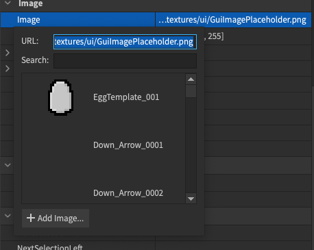
- Click on the details of the
Imageproperty of the ImageLabel.
- Press the Add Image Button at the bottom of the menu that appears.

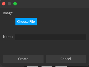
- Press the Choose File button on the widget that appears and select your image.

It should pretty straight forward from here for uploading the image.
Tweaking the ImageLabel's Properties
- Set the property values on the ImageLabel to the following values. Make sure you set the ScaleType before setting the other because it will not appear.

- Set the SliceScale property to your liking. This will adjust the corner sizes.
![]()
Holy moly, no wonder you were typing for so long!
Give me a second, I’m gonna try to smack something together with these methods of yours.
I’d just wanna say, thanks for going out of your way to help me with this!
So far pretty good, but I realized there is a outline around the command search bar thing, and I want to have something similar like that too.
mine:
theirs:

also the outline is too tough but I think I can customize that on my own.
UPDATE: nevermind it was simple to add the outline.
You said you were a rookie… Yet, your better than me💀
wydm, I am a rookie not good trust me.


