I suggest making the character and the noob head a separate image and put an outline and make it larger so people can see it, blur the background and make the logo a lot bigger because no one would be able to read it when it’s in the website.
I’m not the one that made the icon and don’t know much about graphic design so I can’t really do that :/. Still, I’ve had icons that are a lot worse in my opinion get a much higher CTR so I’m not sure why this one is so low.
Well then it’s because Roblox removed ads for <13 users, practically no one above 13 clicks on ads, they just ignore it or install extensions to remove it.
It’s hard to tell what the issue is because it could be multiple things:
age (can’t do >13 anymore, you didn’t click the 17+ either. Can’t you click both 13-16 and 17+?)
timing (when’s the best time to advertise? Weekday v.s. weekend, or day specifically.)
money spent (you spent 300 which isn’t that much in terms of what I’ve seen/heard. 5,000 or 10,000 is what I’ve heard is what you need for it to be effective apparently.)
The icon itself doesn’t tell me much about the game. From the title I get that it’s about noobs, and I see one noob head on the ground in the icon, but I really cannot tell what type of game I’d be getting myself into.
There are other things that might be helpful like color theory, a boarder, vignette, etc.
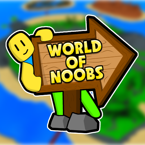
Thanks for the feedback, I decided to just scrap that icon and replace it with this:
Do you think this is any better?
It still doesn’t really show what the game’s about, but it does show the game map in the background and the logo is big enough to read. It’s hard to really show what the game’s about in the icon since the icon is pretty small.
Yep, I think this icon might do better for the audience your going for. Although, I think it might be a good idea to try different types of advertising/marketing. You could maybe make a trailer on YouTube, put something on Twitter or TikTok.
Also, yeah, I was confused about that for a sec. Here’s Roblox doc. page on that btw:
might be helpful idk, lol.
In that case, it might be a good idea to advertise too. See which does better maybe.
It’s definitely better, but the background should be more blurred, the icon be put to the side a little and put the character on the bottom right with an outline. Also I suggest using a sunburst in the background too.
I would make the foreground image even bigger!
In my opinion the background is there just to fill an otherwise empty void. It shouldn’t be distracting to what you want to show in the foreground.
Other than that the ‘[PRE-ALPHA]’ in the title may be putting some users off. But I’m not to sure of that.
There is also some luck involved in advertising your game. So next time you might get luckier.
I would try running the sponsor again with the new icon and the same amount of robux. To see if that improves anything.
(Definitely keep us updated )
I sponored it with the new icon, its CTR was 0.024% this time but that’s still not great . I wonder if people might not be clicking on it because it doesn’t have any players, maybe people are more likely to click on a game that has people playing it.


 )
) . I wonder if people might not be clicking on it because it doesn’t have any players, maybe people are more likely to click on a game that has people playing it.