I made this UI I’m probably never going to use for fun and I wanted your opinions on the UI so I can improve in the future when I create something similar.
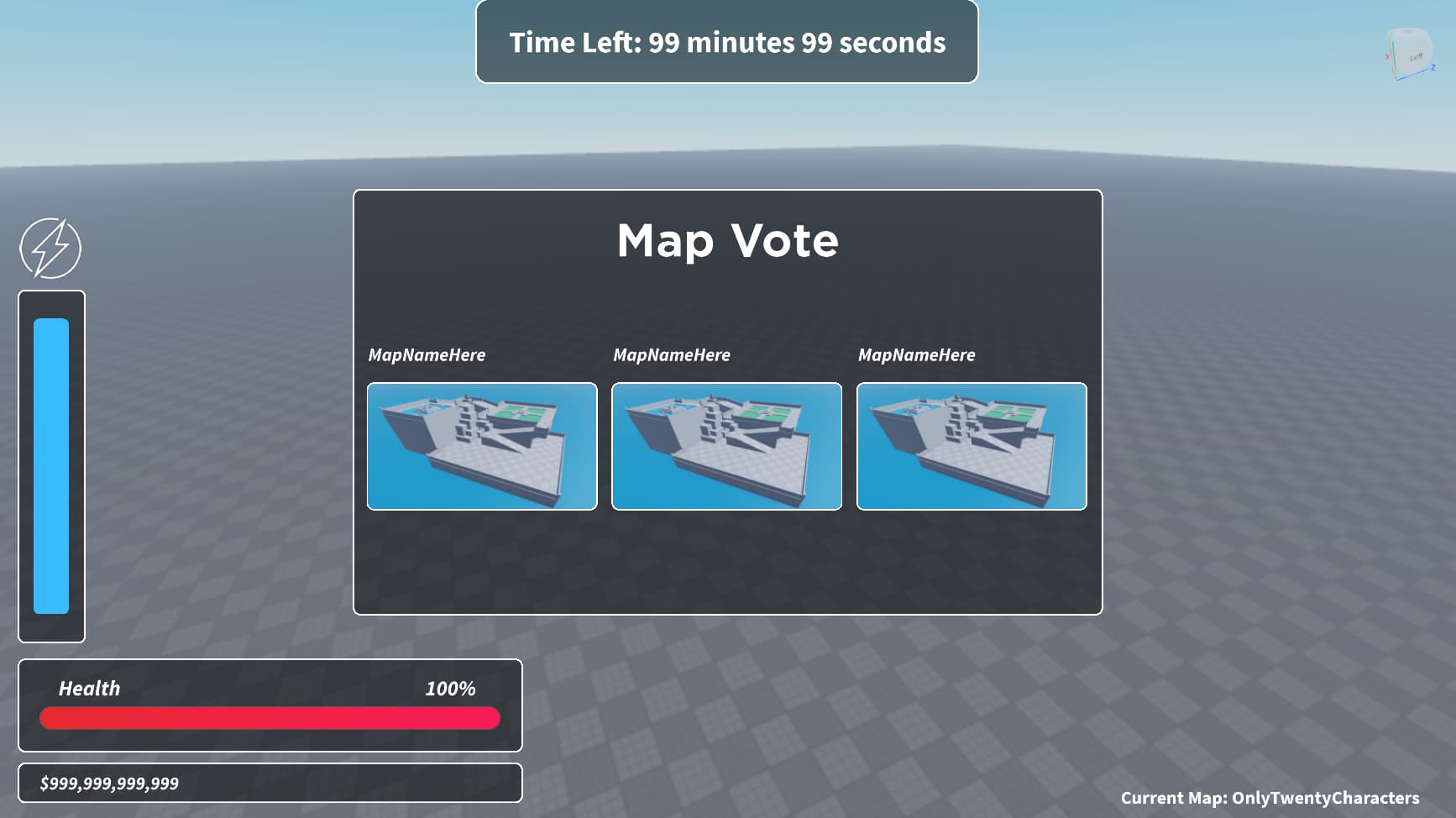
I think it looks good; however, I do get the feeling that something is missing. Might be more colors what is missing. Maybe if you increase the size of the white outliner, it will look better. Also for the money, I’d say a green color somewhere - maybe a green dollar sign -, as that not only excites players but also readily let’s them know what the bar is.
1 Like
I was thinking of adding colour to the currency but I didn’t know if it would look good or not. I’ll try experimenting with some colours though
1 Like
That’s exactly how we succeed, isn’t it? Experiment till we nail it!
I tried a gradient I liked using on my other ui and this is the result:

I’d say that’s more of a blusih green. Search in your browser “dollar green,” in images you will find a color that better resembles the “idea” color we usually have of money. If you search, you might even find RGB values for that green!
Also, if you can outline the dollar sign and/or the numbers white, I think that, combined with dollar green insides, the bar would look much better!
1 Like

Already looks a lot better. You might be able to notice the slight outline of black. I couldn’t make it white since the UIGradient changed the colour of the stroke.
1 Like
Ah, I see. The color does look much better! And, I imagine, what do you think about a larger dollar sign all the way to the left (and you move the current numbers more to the right) or to the right? I think that would instantly make it better. An alternative to this that might be even better and more engaging would be moving the bar a bit to the right and placing a big (like 2x-3x the height of the bar) dollar sign, so that again, players can readily see what’s going on.
I don’t know about that, you’d have to check, but for now one thing’s for sure: The green color really helps.
1 Like
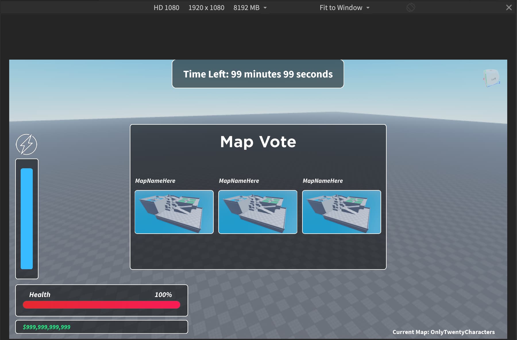
Overall, it’s not bad. One thing to note is there is a significant amount of empty space in your UI which I highlighted in the image below. In addition, I’ve added some other minor things to change that I think would help improve it.

Oh yes that’s mainly because I was using the “Average Laptop” scaling while making the UI but when I had to build the Map Vote, I scaled the display to 1980 x 1080 which is the reason for the space.
Average Laptop Scale

HD 1080 Scale
2 Likes
Love the modern design you used! This will look great in your game.
I think it looks great, but I feel like there too much of a gap in the voting menu. Maybe reduce the gap size in the map menu. Other than that, great job!
Hey, Ion, I saw the new version in “Show off your UI designs” Show off your UI designs - #1328 by Scriptz7.
It looks much better!
The enlarged letters look way better than the previous ones; they look much more engaging!
The last thing I have to say is the size of the rectangle of Time Left looked better with a higher length (as in the image of this topic or a bit shorter), because now the ends of the sentence almost touch the edges of the rectangle, disrupting the harmony of the GUI.
I thought I’d add this to help a bit more  , hope the mixing of topics didn’t bother you.