tell me how can i improve it

please rate it out of 10 its urgent
It’s missing a dash of gradients.
Try this one:
goodGradient.rbxm (620 Bytes)
(I prefer to use this one for buttons)
AhEM:
1 Like
why are you watermarking it bro it just makes it impossible to see and also no need to watermark smth that simple. I would rate it a 7 since it is really simple and theres nothing really there…
what do you mean?
can you send a pic i cant launch studio
send a pic of the gradient

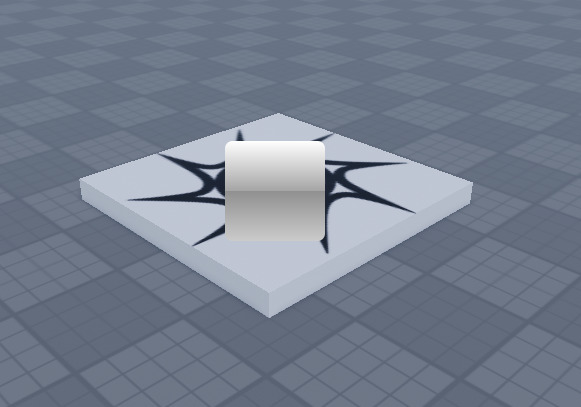
I’m still trying to improve the gradient, though. I do think it looks cool.
Anyways, what is the grid of items representing? Are they supposed to hold images or text?
1 Like
ye they are supposed to hold images
its a bit too white
You can always change the color on the gradient if that’s the case. Like I said, it’s not quite done yet in my opinion. It’ll look better if you change the background color to red (I probably don’t need to show you, it’ll just look better).
What kind of images? Are they viewport frames or image labels? Do they have transparent backgrounds?
My tip is to give images a sort of “glow” effect with a black background. I recommend transparent images if you have the option.
1 Like
ok
imagelabels
hmm will try that thank you
ppl always steal my works
thank you so much
1 Like