Project Name: Still don’t know, about searching.
Style: Modern
Program: Boblox Studio
Was funny to make it with my friend (testing)!
This background gradient is kinda taken from MiRBX, so yeah…

Project Name: Still don’t know, about searching.
Style: Modern
Program: Boblox Studio
Was funny to make it with my friend (testing)!
This background gradient is kinda taken from MiRBX, so yeah…

also remade player info
Sorry for bit of scripting notices here, what service do you use for Countries? I just never used it.
Thanks!
I’ve worked on a lot of UI Recently
This was designed for a RPG style game.

And this was designed for a Military game.

I work on a lot of UI Projects and hope this post can propel my work/designs. 
Main Menu UI on a new game I’m working on.
Inventory UI i made a few days ago. Made using photoshop
AltraeonNova#0001

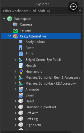
Ingame explorer


hey are you up for hire? if so could i get your discord to contact you?
what platform did you make this?
30-100k for simple designs? What world are you living in XD
Damn, you might as well un-cancel development.
No way, the design alone goes hard but the fact that you made it on the free to use website Photopea makes it 10x crazy.
Been redesigning all of the UI elements for a game of mine. The old UI was… something…
Im not finished with everything but I’m done with all of the major menu items which is most of the UI.

I managed to get the old weather UI back! How did i do this?
Super cool! I love how everything is easy to read and understand.