Oh, I already knew about the new TopBar design. I had my doubts about why there were two chat buttons.
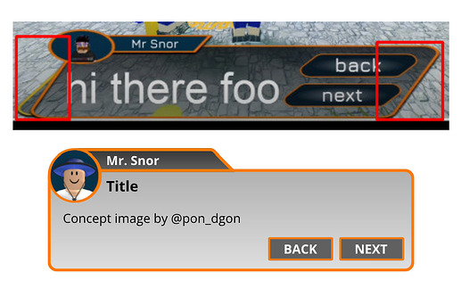
As @iiNathxnism points out, your UI has problems optimizing for mobile devices and other devices. I have created a concept image of a UI design that looks good from any device, so please use this as a reference for your future UI design production!
Figure 1: Example of an optimal UI
Also, when giving users choices, the choices should be concise and the color scheme should be easy to understand at a glance.
Figure 2: Example choice prompt

It is preferable to label buttons that only have icons, since users may not know what the button does.
Figure 3: Example of button labeling
All concept images are created with respect to the color scheme and shape of the original design.
thank you for pointing that out, I had a bad time explaining that without proper alternatives xD
Having consistency, mostly with the UI’s around all of the entire game could bring out the best of the features of your game, and easy to read for your Playerbase. Complex sometimes does not work for other people, mostly with others who have eye-sight problem that could probably can’t determine some of the parts of your UI that could result in your player’s confusion.
Use a Font that is clean and easy to read for the Eyes.
U chose the parallelogram cuz it match with the game theme
Can this squares fit with the menus
How will this match with the topbar
The two chat buttons are because the chat button in the new topbar moved to left is with two clicks
I use jura as font
↳As feedback from others, The parallelogram window you created takes up too much screen space.
↳There is no need to consolidate many functions into TopBar. It may be better to focus on usability.
↳I think one chat button is enough.
Been reworking a lot on the UI, and I had such major Improvements from the Before and After(Check the Forum Post Link) Here’s the Video if you don’t want to check the Whole Forum Post
Here’s the Full Update List for the Main Menu Showcase I have been doing for a game ![]()
This looks like google’s Material You
that is one of the most beautiful UIs I’ve ever seen.
This is really good. I especially like the switches on the bottom right.
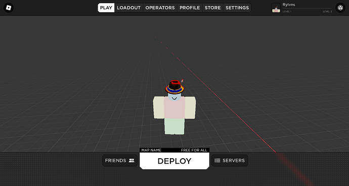
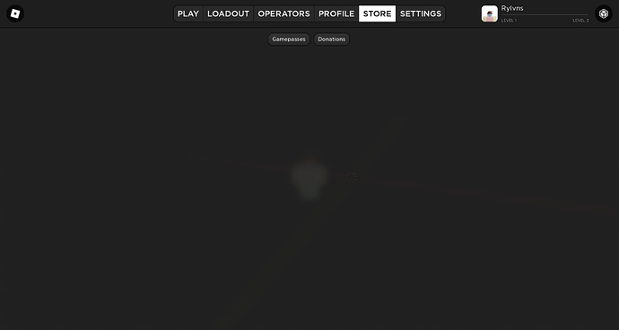
my current fps game ui, the store page is not done.
tell me your opinions on the play page and the bottom tab where the deploy button is; should i keep the plus patterns, replace them or remove them and do a gradient or something
some ui i made for a plugin of mine
not that good, but usable
Hey, check out this UI I made, have not yet completed it, but please share your feedback. Am really proud of what I’ve done, all made with Roblox Studios!!!
Here’s an update on the Game’s UI I’ve been making and I have been adding a lot of custom stuff to make the game more Unique on its own way.
Here’s the complete Update:
I am currently looking for work, and would love to help anyone with there game. Contact me via discord TwistedKale's server
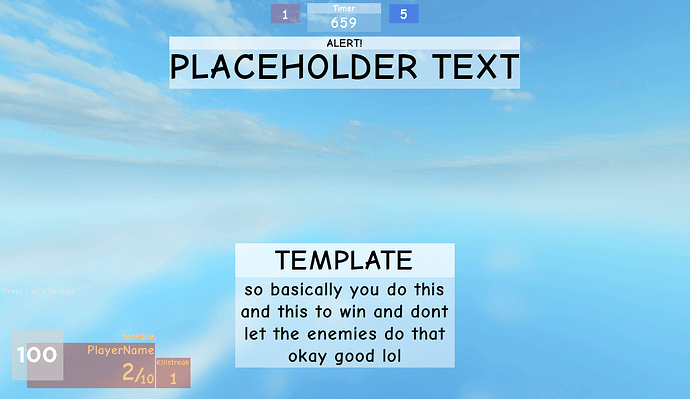
i literally made all of these today and yesterday i can’t stop someone help me ![]()
these 2 were referenced off of the round end ui in the imperial insurgence’s maps
death screen
idk what this was supposed to be just a christmas themed thing
this is pure garbage ![]()
![]()
erm also i figured out how to make this teleport thing i just used one frame with a uicorner and added a uistroke with a large stroke amount

![Simple-Modern Sleek UI Showcase ✨ [Main Menu]](http://devforum-uploads.s3.dualstack.us-east-2.amazonaws.com/uploads/original/5X/f/d/7/9/fd79e1e5134bd102d44f55b7293a4033f16f9e35.jpeg)



![The Diamond Tetrarchy RP Showcase [Part 4]](http://devforum-uploads.s3.dualstack.us-east-2.amazonaws.com/uploads/original/5X/1/b/d/8/1bd87dbf40f16dcfffa9934c9eee072b98d2aea9.jpeg)


