This update is seriously unusable. Every 3 weeks or so I’m forced to reinstall Studio or go through a process of annoying tasks just to make Studio’s workspace LOAD properly and not load in a stupid external window that can’t even be used/opened; just for the workspace to keep flickering and freezing when playtesting. And i’m sure I’m not the only one. This has been going on since this released, 2 months ago and Studio always somehow ends up becoming unusable because of this. There are also multiple posts about this if I’m not mistaken.
Yeah, everyone seems to have their own story. For me, the windows go in Ohio if you use them in different combinations, the little tab thing doesn’t save, so it always stays hidden (every time I open studio I have to open it back up again), and of course, the loading screen freeze bug.
Bump, this update is seriously affecting me and everyone else’s workflow who is too used to the old icons to just width draw from them in an instant (or just not wanting to use the new icons). Either way there should be an option to select beta or old. Sad, someone please listen.
Am I in some sort of twilight zone or is “Enable DPI Aware Studio” missing from my beta list?
Edit: nevermind I’m a little late on realizing that that setting being able to be disabled is what was allowing me to once enjoy the old icons for the last time without having to fight my way to get them back.
can we please get the old icons back, at least an option for them? of all the things to simplify, these icons are not one of them. It is getting hard to distinguish things when every icon has been turned into a single basic shape and color. It was way easier to tell things apart when they were more detailed
I’m not liking it at all. It’s so confusing and all of the simplistic icons just blend together. It feels like I’m doing a pixel hunt to figure out where stuff is in the toolbox. If they absolutely needed to change the icons (they didn’t) they could have at least made the new ones look similar enough to the old ones where it’s not so disorienting and having to re-learn what everything is. With pretty much universally negative reception to this change it just makes me wonder; who was this made for? I’ve been using roblox studio for almost 15 years now and just looking at this is legitimately making me dizzy.
Famfamfam is free to use. There’s a reason studio has been using it for almost two decades. The icons have changed to unlock Roblox from relying on famfamfam + refresh the appearance of studio.
Kindly put, it’s very minimal effort now to set up a custom icon pack for Studio. Don’t complain about having to do it when you only have to do it once. The option existing at all is a gift.
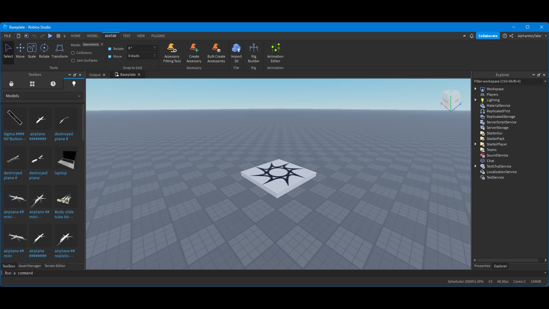
When this icon style is applied, it isn’t just the ribbon icons being changed, instance icons have been changed as well. This is proof in the Insert Object window below.
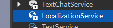
May the unselected Workspace icon please be revised? The crammed colors disrupt the simple aesthetic the rest of the icon set is going for. Reusing the selected version of the icon and making it green like LocalizationService would really do for my eyes.
Imo the Workspace’s importance is already highlighted by its positioning at the top of the Explorer. The extra colors are barely decipherable due to their analogousness and the icon’s microscopic size.
The selected icon of each other Explorer item is identical to its non-selected version. It’s odd that the Workspace is not following suit.