Hello everyone. I’m finally back with another tutorial for UI design. It’s been over 2 months since I’ve done tutorial on UI design and I’m back with more content for chapter 2 of UI design. If you have not already seen the previous tutorial (User Interfaces | Chapter 1), you can view it here. For those of you who don’t know who I am, I’m Sky, an avid UI & UX designer.
So, this time I’m going to be doing these tutorials in bits. Basically at the time I’m doing this (8/13/2020), this bit is chapter 1.2. After all the things I would like to cover in this tutorial are done, then it will mean that chapter 2 is completed. I won’t be making multiple DevForum community tutorial posts and instead will have all the content right here on this post. Anyways, here’s the things you’ll be learning about in this tutorial for UI design.
1. Contrast
2. Gradients
3. Consistency
4. Typography
5. Visual Hierarchy
I’ll also finally be giving some tips on how to get better on UI design plus link some things that will be useful to you for UI designing and you’ll get better with those things (resources and tutorials). Lastly, I’ll link some external programs you can use for UI design.
Tutorials
Chapter 1.2 | Contrast
Contrast
Contrasts are when there is a difference between two things, places or people. Though in this case, I’ll be talking about contrasts for UI design.
In UI design, you want to have good contrast. Not bad contrast. Now what do I mean? Well, let’s look at a quick example.
For instance, let’s just say you designed a user interface. Here’s a UI design:
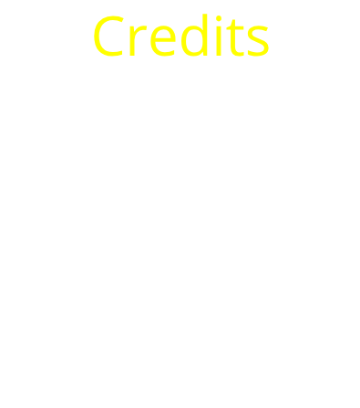
Alright, it’s a frame with some text that says “Credits”. Not really much to it. Though the contrast… well yellow and white don’t go together well at all. This is bad contrast.
Now how does good contrast look like?
Here’s an example:

Red and white together looks nice. These mix of colors are user-friendly meaning these mix of colors aren’t color blinding to people. This is good contrast
Also, whatever color you use with black, it is good contrast
Whenever you are UI designing, always make sure the color choices you pick are user-friendly to the user who sees the UI design you’ve designed.
Chapter 1.4 | Gradients
Gradients
Gradients in UI design is basically when more than one color is used on the UI. Multiple colors can be combined which forms a gradient.
Here’s an example of a gradient:

There are 5 major types of gradients. Linear gradients, radial gradients, angular gradients, reflected gradients, and diamond gradients. If you make UIs on Roblox, you may not have heard about any of these kind of gradients. Not all external programs have all 5 types of gradients on them. For Adobe XD, you can only use two kinds of gradients. Linear and radial gradients. While on Figma, you can use almost all 5 types of the gradients I mentioned (you can use 4/5 of the gradient types I mentioned. The one you cannot use is the reflected type of gradient). On Adobe Photoshop you can get access to all 5 of these gradients.
Linear Gradients
Linear gradients basically have a line where you put dots on the line from the starting of the hue to the end. This is what I mean:

As you can see, there is a line. The linear starts from the left and ends at the right. Though there are only two dots on the line and three colors in the gradient. Why does the middle color of the gradient on the rounded square not show a dot and instead a box showing what color it is? Well, as you can see, each color on the gradient has that box that shows what color is on the gradient. It depends on what program you are used really. The line may look a bit different to you if for instance you are used to making gradients on Adobe XD. I made this gradient on Figma.
Radial Gradients
Radial gradients go in a circular pattern. This is how a radial gradient looks like:

This gradient was also made in Figma.
These type of gradients (linear and radial gradients) are often used on app icons. For instance, the instagram icon.

The instagram app icon used a linear gradient.
Angular Gradients
Angular gradients goes counterclockwise around the starting point. The line between the starting point and ending point of the gradient shows the angle.
Here’s how an angular gradient looks like:

This gradient has also been made on Figma.
Reflected Gradients
A reflected gradient is basically like a mirror. This type of gradient has a color that is mirrored to both sides of the starting point on your UI.
Here’s an example of a reflected gradient:

This example is not made by me.
Diamond Gradients
Diamond gradients create a diamond shape from the starting point of the gradient. The end point is one corner of the diamond shape created by the gradient on the UI.
Here’s an example of a diamond gradient:

This example was made by me on Figma.
How can I make gradients on Roblox?
First, go to StarterGui and insert in a ScreenGui. Then name your ScreenGui whatever you would like to name it. Next, put in a GUI element into your ScreenGui. Then, add a UIGradient constraint to your GUI element. Click on the “Color” property in your properties section. Then you’ll see a box with 3 horizontal dots on it. Click on that box. You should see this pop up:

There are two triangles below that white bar. Click on the one that is on the left. Make it whatever color you want. Once you do that, do the same with the right triangle. Then, you’ll see a gradient. To add more colors onto your gradient, just click wherever on the bar and then you’ll see a triangle where you clicked. Do the same thing like you did before.
My bar is now like this:

Yours may be different depending on what colors you chose and how many colors you applied on the gradient. This is how my frame looks like with a UIGradient constraint added:

For more info on the UIGradient constraint, click on this link: UIGradient [LIVE]
Next tutorial being added by September 8, 2020. This could change and be faster or could take a bit more time.
A video recording on gradients is coming out in a few days after chapter 1.6 releases.
So that’s it for now. Hope this tutorial helped you out. Thanks for reading and have a great rest of your day! 
