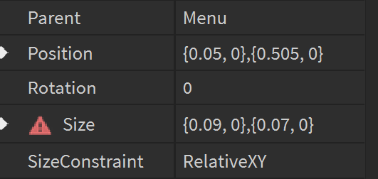
My gui looks good when in studio but as soon as i go to test it they squish together.
In studio:
In game:
When I click on them, it says they are in the same position, even though they obviously aren’t and one of them seems to shrink.
My gui looks good when in studio but as soon as i go to test it they squish together.
In studio:
In game:
When I click on them, it says they are in the same position, even though they obviously aren’t and one of them seems to shrink.
You’re probably making the size and position of your UIs using offset instead of scale, which doesn’t size them or position them appropriately based off of the size of a user’s screen. I don’t know much about GUI design, but I’d try reading this:
Thank you but I think I’m doing that:

Might be wrong tho
I’d particularly recommend #help-and-feedback:art-design-support for asking for help for GUI design.
Related to what @BagArvex said, you can use plugins to change things from offset to scale too, like AutoScale.
Do you have some sort of AspectRatioConstraint inside of the buttons that are different from eachother, that could be making them size differently?
They are all 2.4, so I don’t think thats the issue either
Can you show us where the buttons are in the explorer tab? Just to see their parents, etc
The button will scale differently depending on the size of what it’s parented to, so if the “Content” frame it’s parented to are different sizes, the button will be a different size, and the same for “InvButtonDisplay” vs. “BackToMenu”. Is the “Button” the actual grey part, or is it one of the frames?
The content is half the button and the back to menu frame is the other half of the button. By the way Ive done some more testing and its definatly to do with the size of the screen, they squish together or go far apart depending on the ratio of the screen
Edit: All of the frames under the parent frame are just set to {1,0,1,0} so they should just be the same size
Try putting an aspect constraint in only the first frame of each button, and see what happens. Sorry if this is taking forever, I’m not the best at UI stuff.
Thats made it much better, thank you very much for your help, in terms of the positioning looking better I think I will just have to put them under the same parent frame so that the distance between the buttons doesnt change that much
This topic was automatically closed 14 days after the last reply. New replies are no longer allowed.