As a Roblox developer, it is currently too hard to identify short and long-term trends in analytics visually with it’s graph information. SMAs (simple moving averages) are used as a lagging indicator in data analytics and finance to show changes that can vary greatly in volatility and range over time.
The fidelity of the data points provided in our analytics are valuable (and should stay), but often include volatility/noise that can make it hard to identify change occurring over time when attempting to predict future behavior. This feature should scale the SMA according to the time period selected in the Analytics Dashboard.
If this feature were added, it would improve my ability as a developer to learn, respond, and ancitipate changes on Roblox, my experiences’ demographics, and my players’ behaviors over time. It would ultimately help in the furtherance of improving and maintaining my experiences by making the analytics clearer in what aspects of my experiences are doing well, and what aspects are not doing well (examples; trends in crash rate, ARPPU, player concurrency over long periods of time, et cetera).
(due to the sensitive nature of analytics, I can’t publicly provide images of our experiences’ analytics. I’m willing to provide images to Roblox Staff in private messages if requested)
A simple moving average is the average of some data points that have occurred in the past. Polling results from a sine function as an example looks like this:
The moving average in this example (graphed in red) shows on average what the value reported by a sine wave will be.
(interestingly enough, over time, a sine wave will fractally graph another sine wave! )
If I can give an example that would be a real-world analogy to this graph, let’s assume this problem:
Our experience has a low number of console users who are disproportionately reporting high crash rates. Because our sample pool is low, every crash and non-crash greatly affects the data reported. How can we tell if the performance changes that we’re making result in a downward trend for crash rate?
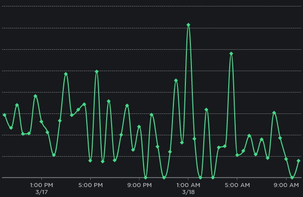
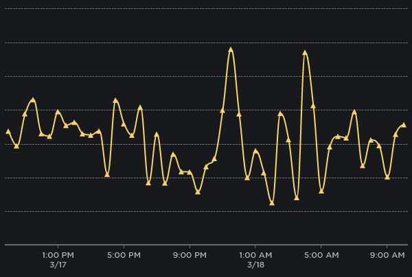
Comparing these two graphs:
It’s easy to see a downtrend in the top green graph, but not so much in the bottom yellow. Questions like “did our changes do anything? are the users’ devices introducing noise? et cetera” arise. The average of these data points overlain on top of the graph would give me the picture I need to tell if the changes I’m making work.
I see so you want to add like a 7 day moving average line? Will think about it - most charts show benchmark lines too so don’t want to make it too crowded.
