hello everyone here is a follow up on my post about a game i am working on that is called planet prospection based off of astronner (an off roblox game) here is my original post and here is current progress Progress
i have made a main menu that look’s nice, here’s a video of it (please give some feedback)
i have also started to work on the map and main features of the game like building, crafting, and weather system i will hopefully keep update’s on the game coming out on the devforum i will hopefully release this game this summer hopefully i will make a dizzy server and link it soon
Hello, I’m here to give constructive critism. Please do not be offended by my advice.
Not to offend but I strongly disagree.
Here is some ways I believe might make your GUI look decent. Remember, everything stated is subjective and not based on fact. People have different preferences so do not lash out if you do not agree.
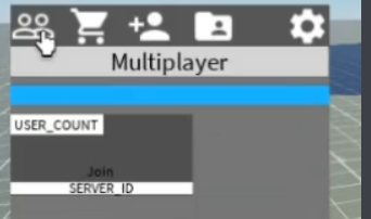
Your images are too big and unevenly spaced
You need to make sure that your images are all evenly sized, consistent, and that their size is acceptable for the space its being put it. You need to decrease the size of the images because they are too big for the amount of space you gave it.
Your images are inconsistent
your images have a trend of being mostly filled white with the background being transparent however on the far left, your 2 heads are not filled in but the inside is transparent.
The use of black text
Using black text looks really ugly.
Poor Text contrast
The black text is too dark for the gray. It makes the join hard to see
Unfilled buttons and Filled Titles
I can see from this image that you made the background transparency for your ‘join’ button to 1 and the transparency for your labels to 0. Its a good idea to make titles which display things to have transparent backgrounds or slightly visible backgrounds while having buttons have fully visible background.
Inconsistent colors
your colors are not consistent. Make sure you are consistent with what colors you use
White backgrounds
Just don’t do it.
Inconsistent text sizes
your gui is on the very edge.
Make your gui like centered cause it needs to be evenly spaced better.
Text to close to edge of screen
Your text it too close to the screen. Make sure your text isnt so close.
Use darker grays.
Your grays are too light and it looks bad. Also Please no white backgrounds and please switch text to white.
Change white backgrounds to the same gray as your other guis.
Here is an example of your gui which uses the suggestions I said just for comparison. I also like using UiCorner however UiCorner doesn’t necessarily make gui’s good and are controversial.
thanks for the feedback i will hopefully implement this but i have no idea what to change the white background’s to for now they are just placeholder’s
yeah i have looked at astroneer’s GUI i have played a couple hundred hour’s of it myself i am taking some inspiration from astroneer and putting it on the GUI
Although this is more general, I see a lot of typos and grammatical in the game. For example, you say, “hey all you beta tester’s here is some thing’s we changed,” "the ability to join friend’s, “Credit’s”, and “Tester’s and QA”. I’m sure there’s more though.
If you really want to go professional and have some very nice looking GUIs, here’s my tip, if you have an iPad:
Download Procreate, it’s:
Easy to use, you can make some nice-looking GUIs without experience (talking form experience)
Professional
Well, I never created GUIs that I used, but I made a couple drawings on it which I will not share as I need them for a Game, and they aren’t that good, as im not good at drawing, but it’s very easy to use, I can guarantee it, and it’s also professional, I could send some images I find off of the Internet made with Procreate if you want
Here’s a random image of people using Procreate to create a ghost:
I can also guarantee its professional as I have a friend that uses it and can make some very cool drawings (which I will not share here as I don’t have his permission)
Hello, It appears you are giving advice on using procreate for icon designs rather than game UI designs. I agree that creating custom icons for your game instead of using googled images is better. Make sure to clarify in the future that you are suggesting procreate for designing icons rather than the entirety of the GUI.
the players icon feel too far to the right and the settings too far to the left, try to space out the 5 image buttons evenly if possible, it does look quite simple to a person who see it for the first time