In this post I briefly covered scale, so please use the visuals, information, and tips in that post while I build off what I said in this reply…
First off I don’t quite understand what you mean by “especially with Crop and Fit configuration”- (So for more details in that regard please build off what you were saying) as for the most part scaling is the same, when you encounter difficult scenarios ‘Constraints’ can be used to help you out.
Initlization –Hypothetical
Say you creating a button in figma, the dimensions of said button are 200x55.
Setup
1.)
What I personally like to do is to navigate to my device emulator, go to the ‘Average Laptop, 1920x1080’ screen.
2.)
Insert a ScreenGui into ‘StarterGui’

3.)
Then, insert an ImageButton into your ‘ScreenGui’.

By default the ImageButton’s size should be 100x100, in offset.

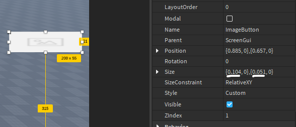
What I like to do is to set that size (in offset) to whatever the dimensions of the image I’m Importing is for example I would set the size of the ImageButton to {0 -scale, 200 -offset, 0 -scale, 55 -offset}

By the way, you do not need to type in size with brackets when directly editing the property.
Then, navigate to the properties of the ImageButton and actually upload my image the visual integrity is maintained.

Now the problem is scaling it for devices,
As I iterated in the post the best, most efficient way to do this is using this plugin I will still go over how scaling works at the comprehensive level but it makes no sense what so ever, to spend your time doing the rather complicated math when there a free resource, a tool that does it for you.
Scaling with AutoScale Lite
1.)
Ensure the UI element in question is selected, in this case it will be the ImageButton example from earlier…

2.)
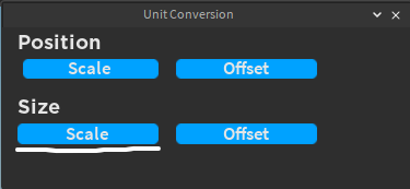
Click Unit Conversion on the plugin.

3.)
As roblox sets positing to scale by default no need to worry about that, click ‘Scale’ in the ‘Size’ Row:

4.)
Now we can see that the ImageButton is scaled, while its offset values are 0, still maintaining the correct dimensions at 1920x1080 screen display and button dimensions of 200x55:

That’s how to scale, with AutoScale Lite, in a nutshell, I will now go into the comprehensive part of scaling.
What really is scale?
Scale is a bit of a tricky subject, so bare with me.
Scale operates on values 0-1, 1 being the entire length or width of the parents display -depending on if its scale x, or scale y.
When I say scale I mean regardless of size or positing. Ill give you an example.
Example
This frames position is {0.5 ,0 ,0 ,0}
Frame:
That positioning is scale, operating on the 0-1 we talked about earlier. Essentially, its halfway in between; ‘.5’. The X scale value Isn’t quite 0 which would have it at the total left corner, and isnt quite 1, which would place it at the far right, its the exact same thing with the Y axis.
X value at 0: (SCALE) – Position in the photo {0, 0, 0 ,0}
X value at 1: (SCALE) – Position in the photo {1, 0, 0, 0}
Y Axis
The positioning works the exact same way on the Y axis, it’s just on a different axis, lol.
Y Scale at .5, Position = {0, 0, 0.5, 0}:
Again illustrated by this photo, its halfway in-between, not quite 1 at the bottom left and not quite 0 back at the top left.
Y value at 0: (SCALE) – Position in the photo {0, 0, 0 ,0}:
Y value at 1: (SCALE) – Position in the photo {0, 0, 0, 0}:
Combining the two…
Now that we have an understanding of single axis positiing scale, lets combind the two to center this frame in this screen. Do note, anchor point is at (0.5, 0.5) I will go over that in another reply if needed.
X & Y value at 0.5: (SCALE) – Position in the photo {0.5, 0, 0.5 ,0}: –Anchor point at (0.5,0.5) also!!
Now we have a perfect center in the frame relative to screen size.
That concludes the Scale positing section of this reply, It is very important to take note that the scale values aren’t limited to 0-1. Simply a range you want to stay in assuming you want your UI on the players screen. Its perfectly possible and okay to go higher or lower that number range.
Size Scaling
Size scaling works the same way but gets more complicated the more descendants you have.
For example
I’m going to set this frames Size to {0.5, 0, 0.5, 0} after I do this I will be “re-setting” the postiion to {0.5, 0, 0.5, 0} -Center*
This will set the frames size half as large as the width and half as large as the height. As the players screen is the supposed ‘Parent’
As we can see the frame is the correct size a direct half (To the pixel) of 1920x1080
1920/2 = 960
1920 * .5 = 960
Frame X size (in pixels) = 959. Sometimes roblox will get it off by a pixel or so
1080/2 = 540
1080*.5 = 540
Same process with frames inside or frames, its relative to the ‘parent container’ thats what scale is.
Hopefully you see where this is going As this reply is getting very very long I’m going to break it here, don’t hesitate to follow up if your lacking understanding of certain aspects of this or would like to see other UI element/properties gone over. I’m always happy to help!
Happy Devving!


