DISCLAIMER⚠️
This is a pretty long in-depth step-by-step tutorial so if your not going to be willing to get through all of it, you can save yourself some time and click off nowBackground
Ever seen those like bright cartoony thumbnails/icons? Yeah, they look really nice since most of the a drawn using like a digital art program and of course the artist is talented aswell!
So I’ve never been the well the super artistic type and I’ve tried to create some uhh art using various 2D art programs but since I was using a mouse it was always super hard to just create the look I was going for…
But, I’ve been getting really comfortable with Blender lately and I figured out that like you can create pretty much shapes and different things in combination with grease pencil to create some really nice looking art, and although it was painful 3 days of trying to figure out how to make masks and outlines but it was well worth it and now I can bring y’all some free value so you don’t have to go through that and you learn something new! ![]()
![]()
MY First Blender 2D Art (using this method)

Lighting & Render & Camera Setup
So in Blender if your don't setup the lighting right for this method then you won't be able to get the TRUE vibrant colors you'll want, also for this tutorial i'll just be creating a icon so the camera dimensions will be 500 x 500So first off create a camera in your viewport at the center of the world
For the settings change the camera type to Orthographic
In View Layer properties in Passes > Data make sure to check Combined and Z

In the output properties, copy the settings you see circled, depending on what kind of art your making you can set the resolution to whatever you’d like!
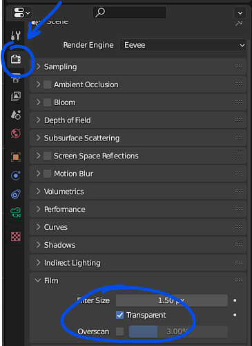
In the render properties, make sure Film > Transparent is checked (this will make it render transparent)
IMPORTANT PART
So this is the part that will give your render those vibrant colors!
So change from 3D Viewport > Shader Editor then change the Shader Type > World

After this make sure your nodes look just like this, the one at the very LEFT is a Image Texture, connect it’s color to the Background’s Color.
For the image just make sure it’s a white background, the reason this works so well is because it’ll give the colors the most accurate vibrance cause it is white if that makes sense!
Here is the one I’m using
Make sure that you change View Transform > Standard, Display Device > sRGB and the Exposure should be 0.000 and Gamma should be 1.000
Difference between Standard & Filmic
STANDARD

FILMIC 


Modeling
Yay, so this is the part where we actually start creating the shapes our 2D Art!
In this tutorial you can either follow along with a reference image of your choice or you can try to follow along with the reference image I got off of pinterest! (it has alot of good reference for art styles like this)
So for this tutorial I’ll only be creating the head as all the other steps I go through can be implemented for all the other body parts or anything else you’d want to make!
What is great about using this blender method is that we can easily 2D shapes and with the help of proportional editing we can customize it even more!
Alright so you can either press Shift + A, navigate to Image, and then click Reference and choose the path of your image!

If you have the latest version of Blender you can also just drag the Image inside of the viewport aswell!
Once you have image inside of your viewport you can click on it and then navigate to Object Data Properties > Opacity and make it 0.7

So I’m starting with the head, so I created a circle and set the Vertices to 16
After thiis select the whole circle in edit mode and then press F to fill


Here is how that is looking right now! Great!
Problem right now is that as you can see the head is not completely as smooth as it should be so this is where we add a Subdivision Modifier to make it smooth
Click on your circle mesh and then heaad over to Modifier Properties > Add Modifier and add a Subdivison Surface, and copy the settings you see in the screenshot (or you can adjust it to your liking but make sure it’s on Catmull-Clark)

This is what it looks like after you’ve added the modifier, nice and smooth!
At this point you can go into edit mode and move around the vertices using Proportional Editing, to get the shape you want!

Now let’s move onto the coloring of the head, there are 2 ways to do this… you could either add a material (which is what i’ll be doing) or you can converted the head into a grease pencil and then color it that way but too keep it simple just add a material for the color you want for the base shapes!
So navigate to Material Properties and create a new Material, I just called mines BodyColor, and make sure to Set all the properties below Base Color to 0.000 (this is so you can get the truest/ most accurate color)

ALRIGHT, if you made it this far have some chocolate! ![]()
Okay so, now that we’ve got the shape and the color down, the next part is creating shading and also of course the facial bits like the mouth and the eyes! This is where the grease pencil comes into play!
Since we’re going to be using the head to also create the outlines, we’re going to have to basically use a dummy copy of the head that we’ll convert to a grease pencil so we can draw stuff like shadows using the built in clipping grease pencil provides for layers!
Duplicate the head so that you have two of them
Right Click any one of the meshes and then convert it to a Grease Pencil

After that, you do this hide the other one out of the viewport and also the Render (its the eye icon and the camera icon)
![]()
After you’ve done that you’ll be left your head that you converted to a grease pencil!
You’ll notice that it has a weird outline around it, to fix this
Select your grease pencil head, and head over to Object Data Properties, and then you’ll see 2 Layers, one is for the Fill of the head and the other one is for the Stroke (outline), so click the Stroke layer and then press the minus sign

When you’ve done this you’ll see the stroke is now gone, great!
Another thing we have to do for our grease pencil object is we have to make sure it doesn’t use lights because we want it too look exactly how it looks like in the Viewport Shading/Render
So in the same tab just uncheck Use Lights

Okay, great! It’s time to move onto creating the shadow and also the face! As seen here!

Head back over to Object Data Properties and Create a new layer using the plus sign, let’s just call it Shadow and make sure to uncheck Use Lights

Now scrolling down in the same Object Data Properties Pane, go to Strokes and set the Stroke Depth Order > 2D Layers (this basically makes the layer’s visibility dependent on how you ordered the layers not in 3D Space)

Head over to the Material Properties of the Stroke, and you’ll see 2 of them, one for the Outline we deleted earlier and one for the BodyColor, so delete the Head_Stroke

Now we’re going to create a new stroke which you’ll use for pretty much all the drawing we’ll be doing with Grease Pencil (shading and face stuff)
You can call the new stroke, “Stroke” and then make sure in Surface > Stroke that it’s checked, but don’t check Fill; also don’t worry about the color

Now were going to change the Mode from Object Mode > Draw Mode
And now we’ll be given this menu at the top which let’s us change the color, size and other stuff about our stroke, but looking at just the color portion we want the Paint Mode to be Color Attribute, meaning we can pick a color and the stroke will be that color regardless of the Material Color we have in our Material Properties

I changed the color to a darker shade of the body color I used earlier!
Finally, now time for some shading! But before we get started, we’re going to need to mask our Shading layer with the Head_Fill layer so that it will cleanly be Clipped underneath!
So we’re going to head over to the Object Data Properties once again, and like the Shadow layer, and then enable the Masks options
After clicking the plus sign, it’ll show you the available layers to use as a Mask (we only have one) and your going to choose Head_Fills

Okay… NOW it’s time for Shading, Click on the Draw on the right hand side, and you can now start coloring in your shading ontop of your Head, make sure the Shadow layer is above the Head_Fills Layer


Also a useful tip is too lock the layer your working underneath just incase you want to delete something on the current layer your working on so it doesn’t delete the layers below!
You can also change the radius, which is right next to the stroke color

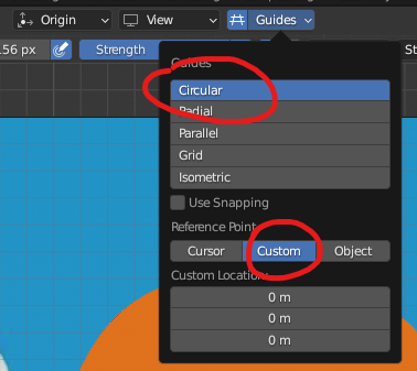
ANOTHER useful thing is to use a guide, in this case for the shading it’ll help it look cleaner, at the top you’ll see this, Click the Grid Icon > Circular > Custom

OKAY, so after you’ve finished your shading however you’d like should look something like this, GREAT!

Now, it’s time to move onto the facial features, so for this we are going to create another layer ONTOP of the Shadow layer
Navigate to Object Data Properties, and create a new layer, and always turn off Use Lights
(If you had Guides on you can turn it off now)

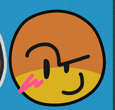
Now we can start creating our face! You can go ahead and change the color and radius and all that good stuff!
When your done you should have something looking like this!
Alright, now we have the hardest part out of the way, now it come’s to creating the outlines! Remember when we created the duplicate of the head before, well this is where it’s going to come in handy
So we’re going to first create the black outline, and then we’ll create the white one!
First unhide the Head in both Viewport and also Render (click the camera and the eye icon)

It should look something like this now

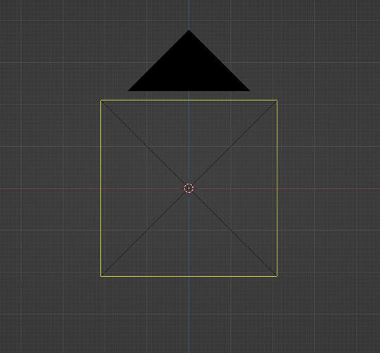
Now we have to make sure that Origin of the head (MESH) is relative to the Geometry so that when we scale it, it scales from the VERY center!
Right click the mesh, and navigate to Set Origin > Origin To Geometry

After this head over to Material Properties and remove the BodyColor material and then add a new material and you can call it BlackOutline, your materials property should look like this after

It can be any shade of black you’d like but just make sure the Metallic, Specular and Roughness are all set to 0!
Now we’ll have something like this!
If you want it to be thicker or thinner, Press S to Scale and then move your mouse until you get a thickness of your liking! (I’ll keep mine the same)
Now for the white outline, we can basically duplicate the mesh we just used and then create a new outline but this time it’ll be white
Also make sure to move back the white outline so it’s behind the black outline in 3D Space
After you’ve done this you should have a CLEAN looking roblox styled head like the reference image!
To render just place the camera wherever youd like

And then click go to Render > Render Image
Voila!

With everything i’ve covered in this tutorial you can pretty much create anything youd like from icons too thumbnails, and don’t be afraid to experiment because there’s ALOT you can do with this im sure!
If you have any questions leave just comment them down below, THIS TUTORIAL TOOK ME ALL DAY, I hope I provided someone some GOOD value!


