Devlog #3 | Paint Punks

You can find the previous devlog here!


Paint Punks is a character based first-person shooter inspired by some classic Roblox games such as Mad Paintball and daxter33’s Paintball! In the previous devlog I started on implementing abilities and revamping the characters. In this devlog I will be showing how that’s going and some other miscellaneous features I have been working on!

New characters

One of my goals for Paint Punks is to create a varied cast of characters to play as, each with their own personality and background. I want to release the game with 15 playable characters. Right now I have 5 designs ready.

Left to right: Leo, Stella, Tony, Sarah, Yuki

Each character is separated into a character mesh (skin + clothing) with a 512x512px texture and a hair mesh with a 256x256px texture. The hair is separated in case I want to sell them as UGC after release.

New abilities

Since last devlog I was able to create 6 new abilities:

  • A balloon filled with paint that can be thrown to deal splash damage on impact.
  • A rocket launcher that shoots a rocket in a straight line, dealing heavy damage on impact.
  • Paint mines that explode when an enemy walks over them.
  • A cloud that blocks vision to outsiders, but lets players on the inside look outwards.
  • Turrets that rotate around and shoot at any enemy that comes within its line of sight.
  • A sprinkler that emits paint from both sides, dealing AoE damage to enemies that pass by.

Below is a quick demo showing off each of the abilities.

Voice chat

After the announcement of the new voice APIs I took two days to implement team-only voice chat into my game. Players can now hear and talk to other players in their team, regardless of where they are in the map. A small UI indicator is also shown to highlight which players are currently talking.

image
Example of what it would look like if 3 players are talking at the same time

A new map

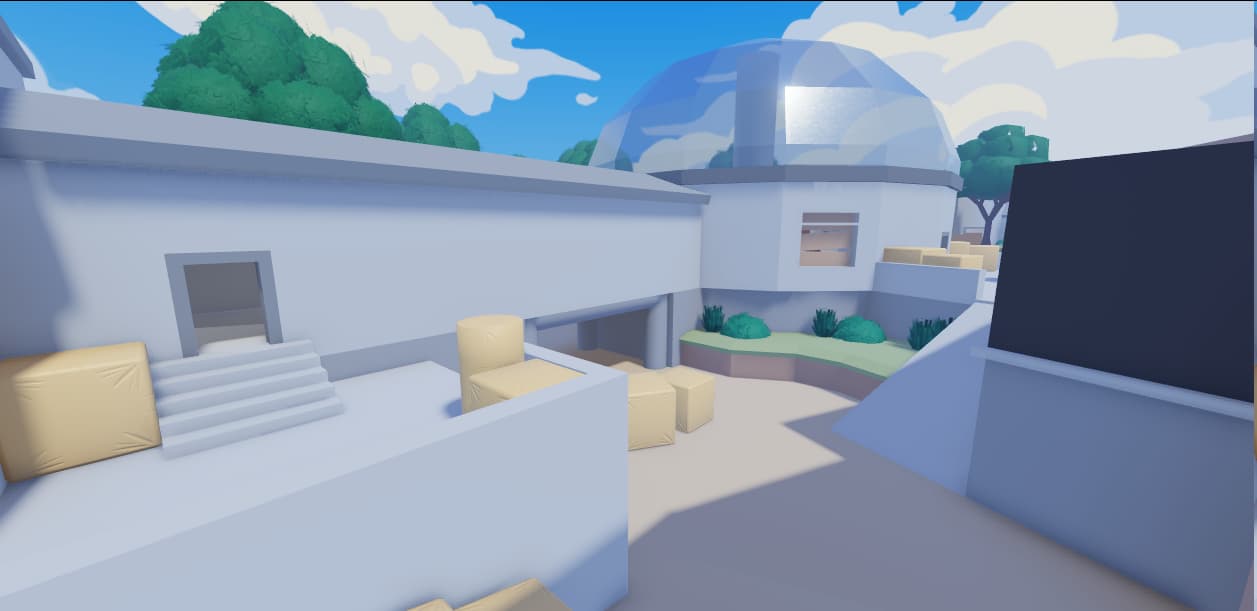
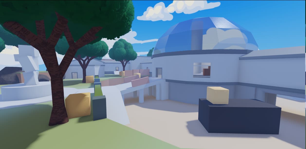
Finally I designed a second map for the game. It is currently still in the greybox stage so I can focus on map design and easily iron out any issues. The map is fully symmetrical and features a large round room in the center. Two large hallways connect this room to both ends of the map. The hallways also conveniently split the map into two sides, one which is more open and one which is narrow with more cover.


Release plans

Paint Punks is getting a lot closer to release. My current goal is to release the game early June, leaving me with 3 more months to work on content for the game. In this time I want to add a few new maps, 10 more characters, 8 more abilities and a third game mode. There are also some progression systems that are missing still. Right now you cannot unlock new characters yet for example.

I am hoping to host some play-tests in the coming few weeks so I can start gathering feedback on game feel, abilities, balance and more.

20 Likes

This game looks nice! Good job on it!

1 Like

This is a very dope project! I love the whole design and aesthetic of the game it provides a child-friendly experience and from what I have seen, an enjoyable one! All the UI designs look dope matching the paintball design of the game, I suggest changing up the voice chat UI as well as it doesn’t fit everything else currently, like making the background similar to the gun information or the player information background.

Another thing I suggest is making a few more dying animations such as when the player steps on a mine, instead of falling over they could explode away with their hands and arms shaking as if they are trying to fly, a funny not cruel way to die.

The map in the video looks amazing, especially with the kind of stylized style you have. I think everything fits and blends so well together, I am really wondering how the new map will turn out.

Great job in the game, I see success for you!

1 Like

Thanks for the feedback!

I did indeed make sure to keep the game appropriate for all ages, but that was mostly by avoiding words like ‘kill’ and ‘death’, and instead using ‘knockouts’ and ‘wipeouts’. Although the art-style wasn’t specifically designed to appeal to a younger audience, I think it’s a big plus that it turned out that way. :smile: I like keeping things colorful and stylized rather than the usual darker tones you find in FPS games.

I agree on the voice indicator UI, good point. I’ll be changing this.

I’m not sure what the best approach would be. To make the wipeout look natural I would probably need some sort of ragdoll so they keep the momentum of where they are going. I don’t know how ragdolls are usually programmed and in my case I’m using skinned meshes for the characters which would probably make it even trickier. I might just have to leave it be for the moment, unless I can find a solid resource.

I think it would be better if players could just play as themselves. These avatars scare me.

Player avatars unfortunately isn’t going to happen - and isn’t really negotiable either for many reasons.

  1. Readability: Given that each character is going to have its own ability and weapon, being able to identify the ‘power’ of an opponent by their looks is a very nice quality of life feature.
  2. Character scaling: With R15/Rthro/whatever it’s incredibly difficult to ensure that all characters are the same size and that players aren’t going to upload packages that make their hitboxes different. People will be doing this given that the game is player versus player. I’ve had to deal with this in previous games I worked on and it’s been a real headache to solve. Playing a cat-and-mouse game of banning certain packages/animations isn’t a viable strategy either given the sheer volume of items and ease of upload.
  3. Stability: The custom characters I created for this game are structurally a lot simpler. They have a fixed weight, size, a consistent hierarchy and so on. Fixing bugs will be a lot simpler if the characters are more consistent.

Past games have used a similar approach (Mad Paintball) which worked well for them. And given that the game is first-person I don’t see much of an issue here either. If there’s anything particular about these characters you dislike feel free to describe it so I can improve upon them.

2 Likes

Overall it looks great! but the guns feel and sound less like paintball guns and more like airsoft with some drag on the bullets. Maybe find some more fitting sounds?

you’re pretty right about those things
a lot of visual glitches happen because of UGC

i would still like to know what are your inspirations for style and design, since it plays an important role in games like these.
im not sure if you’re going for a cute vibe/serious
and um one more little thing, the faces and body types are the same, so if you’re doing a revamp for the models keep that in mind.

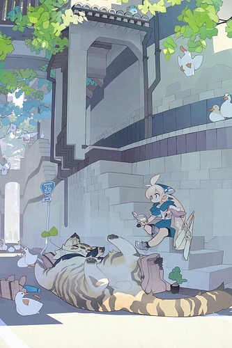
For environmental art I based some stuff on Fall Guys but I also used this artist on pixiv a ton for inspiration.

Example art

For user-interfaces I used Wildfrost and Gigantic a lot for inspiration, but my UI still always ends up looking vastly different.

As for the characters, I just winged it. My game’s materials/textures and some of the assets were created before I even started on characters, so the only goal was to make the characters fit in with the environment. I used some online references for drawing anime characters to get started and then refined the character models until they looked fine.

I honestly have no idea what you are referring to here, sorry.

1 Like

i meant you should add a little variety in face! (i didn’t reread my stuff)
different expressions and stances could be a pretty nice touch
as for the style, the half-chibi is pretty neat and is pretty suitable for a low poly game
but what do i know. not an expert in 3d modeling