Closed down for the time being. - KingBlueDash
You should add screenshots/pictures of what this even is and looks like, there’s no incentive atm to download what you’ve created. Not only that, but you’ve dedicated a significant amount of space on your post to watermarks/licensing that provide no value to whoever will be reading the post.
Here are my primary suggestions:
- Move your “organization” watermark to the very bottom, the name of your “organization” is not the important element here, the product (your CSS styling) is. I would also suggest making it a quarter (or less) of the height that it is now, there’s no need for it to take up so much vertical space (not only that but it being shorter in height makes it look sleeker and more modern).
- Move your product licensing to the bottom as well (prior to the “organization” watermark) and change it to a collapsable/unblurrable text block.
- Now you have room to put plenty of screenshots of your CSS styling so you can demonstrate what your CSS does prior to a person using it (also giving them an incentive to use it).
- I would also put a small centered download link or visual button above the screenshots as well. Or you can have one primary screenshot, and place the download button below it, and then put more screenshots after it. Your choice. This helps funnel people to download after having seen what your CSS does.
Yeah, My Bad, I Was Kinda In A Rush When I Made This Post, I’ll Make Sure To Take These Tips Into Account And Add Screenshots As Soon As I Can.
You have the DevForum+ extension link in the post, consider changing it to roblox extended lol
Suggestion: Consider making the 3 dots smaller

Also any animations for the social media buttons?
I swear i thought put the correct link, oh well, and i’ll modify the ellipsis and add the animations in the next update.
If you were in a rush I doubt you’d spend your time making licensing and watermark images
It would be great if the post was more descriptive because it’s literally 2-4 sentences. Also if there were screenshots like @SoCalifornian has said above.
I already had them ready from my other post (DevForum Plus.)
I’m very sorry for leaving the post in the state it is right now, i was actually gonna add the logo, screenshots and video, reformat the post and such, but i had to go to bed earlier than i expected, leaving the post pretty bare-bones, once i get on my laptop i’ll do all this.
The game playing text under the player name is not properly visible.
(sorry for the sound problem)
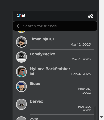
and the last player chat button gets stuck at the bottom

i’m not sure what causing issue #1 to do this, but issue #2 must be caused by how the fade in animation plays, i’ll fix it shortly.
These Issues should be fixed now.
Compatibility with the Most Played tab isn’t great, otherwise - awesome style man!

That was bound to happen, with the fact that it’s currently at dev-phase.
That must be caused by RoPro, i’ll go install that extension and fix this issue.
Turns out my play history reset, so it no longer shows game icons, so i cant edit those elements.
Play some games lol, I think you need like a few minutes in each game
Thats what i meant to say, but i’ll do so later.
Not sure if it’s possible but please add animations to chat opening and closing ![]()
Fun Fact: Some Animations, Such As Hovering Over A Symbol, Switching To His Highlighted Frame, Are Caused By Me Just Adding The Tween Effect.
