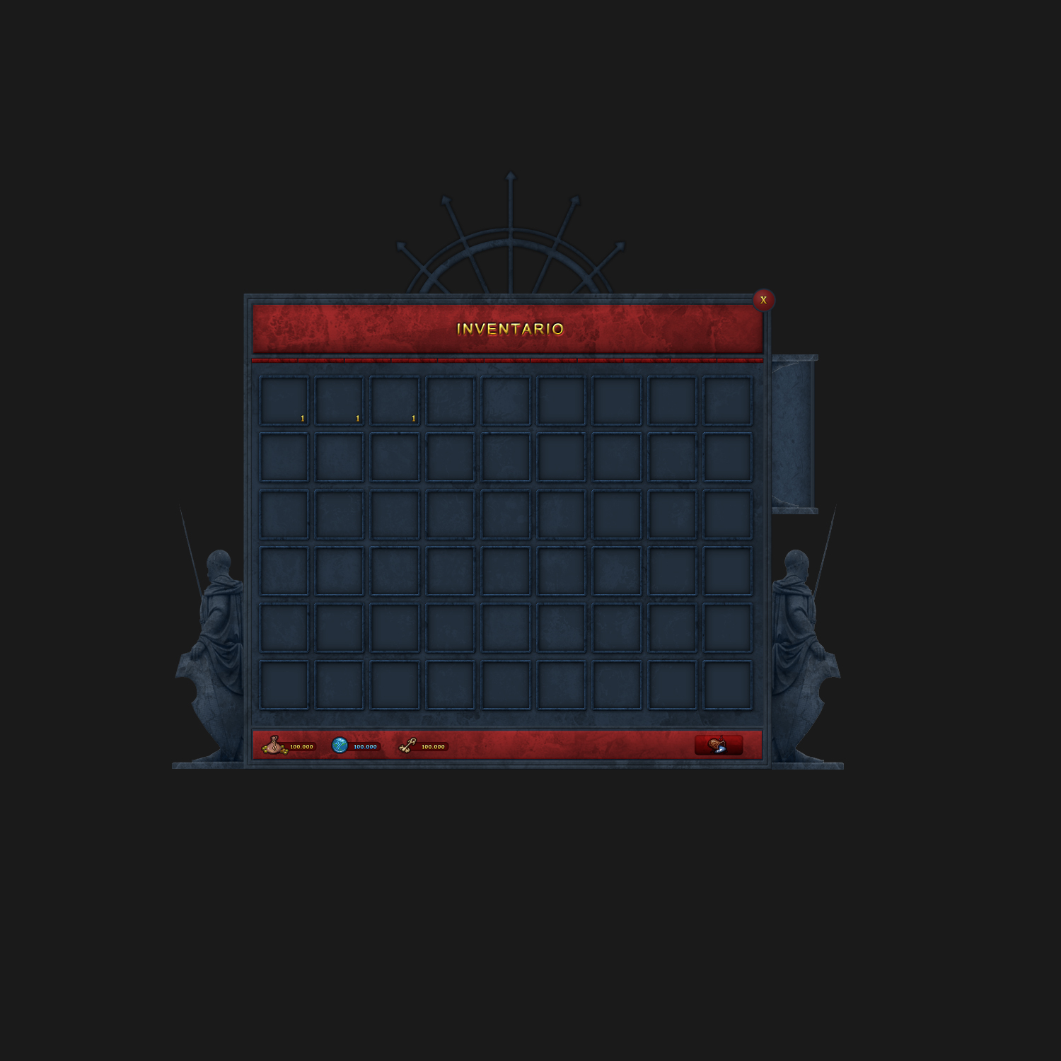
Here’s the Inventory UI for my Murderer Game, tell me if you like and how I can improve it, also give it some criticism so I can get a better understanding on what people like.

5 Likes
Looks good tho I’d told the swords to the left. Looks a lot better when they’re tilted.
3 Likes
thanks for the advice also do you know the best way to get the thumbnail for my items? currently I put a greenscreen behind and chromakey with paint .net and it takes a lot of my time ![]()
A simpler way of putting objects into a UI is ViewportFrame. More information on it can be found here.
I believe the brightness of the outlines of your items’ boxes, against the subtle grey background, could be irritating if done in excess. A subtler shade, or probably even a homogeneity of light grey, would look much better. The boxes themselves are the same colour as the background which could make them confusing – and although I doubt it would be confusing, it’s not exactly simple in my opinion.
Luckily, I was able to find some examples of different inventory UIs on Google here and here.. These both have darker backgrounds and it is interesting to see how they have defined the spaces for items either with shadows or carefully planned colours.
Another criticism would be the smallness of the KNIVES and GUNS labels. If this was on a phone or tablet, it could be difficult to press those.
And lastly, the boxes would be better if their text sizes were all the same. Seeing ‘BloodyKnife’ struggle to fit across the box looks awkward when you have ‘Sonic’ so firmly set in the centre. Is there any reason that most of the knives don’t have spaces between them (e.g. ‘Fire Knife’)?
2 Likes
Looks nice but this is very identical too Murder Mystery.
You might consider enlisting the help of a digital artist. They can help you with the item icons.
As for the UI, I like how it looks. I’m assuming the colors are rarity-based?
Krunnie made a good recommendation to the rotate the knives (45 degree tilt) towards the top-left corner. That’ll utilize your space more efficiently.
You may also consider changing the border of the inventory panel, as the left-hand tabs seem awkwardly small in comparison to the size of each knife box, and the menu borders around the list are tiny to the point of almost being hard to see. I’m not sure if it’s just how the image is cropped or by design but the scaling proportions could use some adjustment,
1 Like
Rendering it in Blender/C4D is the best option in my opinion although you could also try to use the viewport frame
It looks so good, and I wish you continued success!
1 Like
Too scattered and unorganized. Add filters like this:
Filter
Inventory
All Knives
Tier I Knives
Tier II Knives
Tier III Knives
All Guns
Tier I Guns
Tier II Guns
Tier III Knives
Equipped Weapons
You should also add some highlight to tell which page filter you’re on (not a huge indent)
It just looks odd with different colors, but other than that it’s nice. ![]()
You need to focus on making the gui on the background.