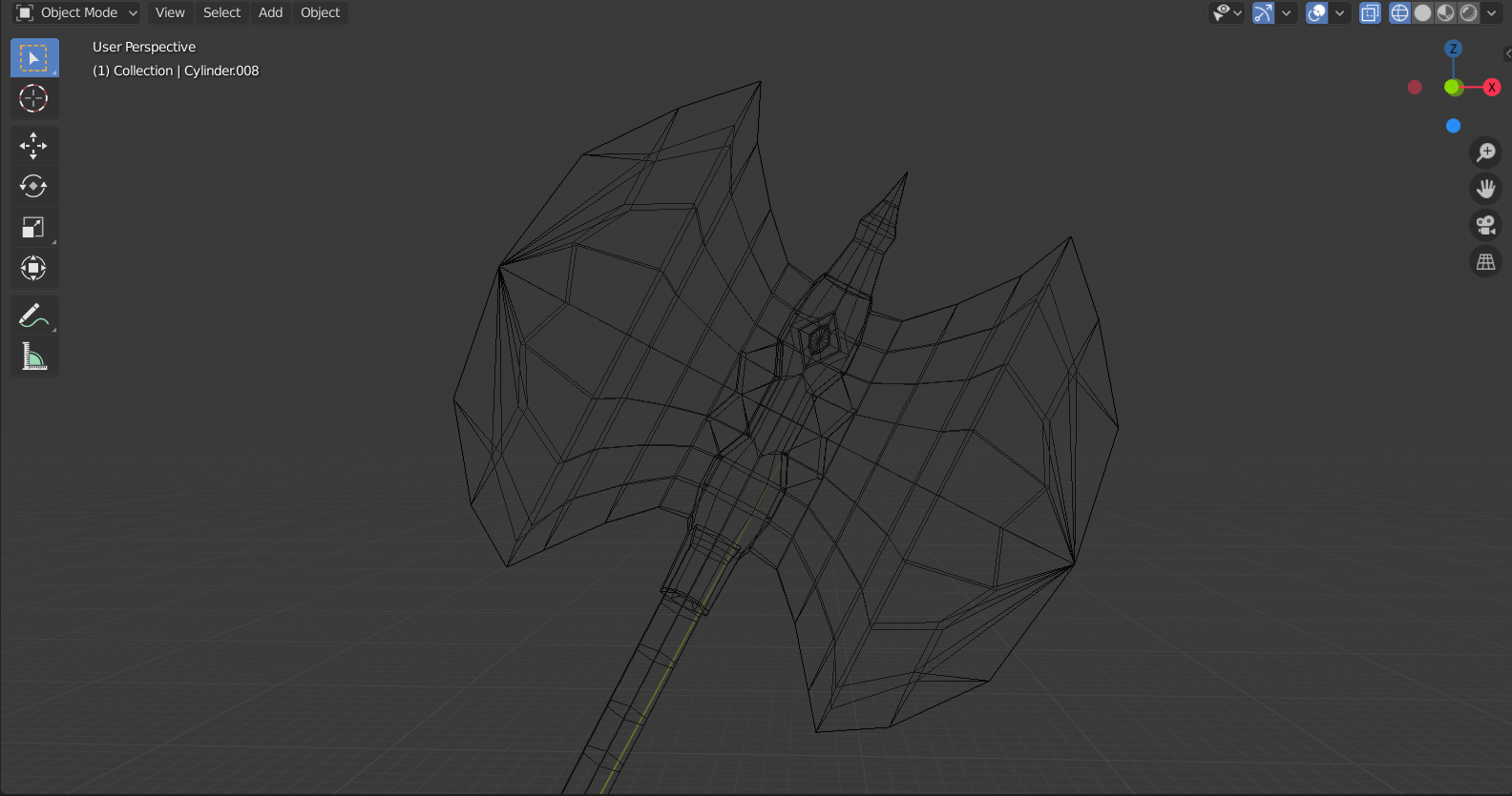
These past few days, I’ve been messing about in Blender, creating weapons. I’m really happy with how the Sword turned out but less so with the Axe. The axe blade doesn’t look right to me. Some feedback would be greatly appreciated.


Thanks! 
These past few days, I’ve been messing about in Blender, creating weapons. I’m really happy with how the Sword turned out but less so with the Axe. The axe blade doesn’t look right to me. Some feedback would be greatly appreciated.
Thanks!
Hey! These look nice but I personally think that green isn’t the best color choice for the blades, maybe gray?
Yeah I just realised that. The lights reflection has turned it slightly green.
gyazo.com/4f397132180994ccc5725acaae461bb0.png
These are cool, but I have a couple of observations.
The chips in the blade of the sword are too low and that makes them really unnatural looking. A blade usually wont chip at the base, it chips more towards the middle to the top.
The axe is good as well but the blade looks puffy, it seems like its thicker on the outside than it is on the inside which is probably why is feels strange.
Other than that these look really good. Keep up the good work!
I like the green. I think you should keep it.
Ok so firstly very good start. just a couple things I’d change.
Discussing only the mesh shading and topography itself, the most glaringly obvious thing I’d do first is switch the mesh shading to smooth. Kinda looks like you’re going for a low poly vibe, but I’d personally do that. That should sort out some of the weird shading on the axe blade, and make the sword look slightly better too. Add an Edge Split modifier to preserve sharp edges where they’re needed, and play with the slider till you like what you see. The default is 30 degrees, I find between 30 and 50 to be best for most situations.
This should help make the handles of both weapons look more round too. Try it out and see if you like it.
With regards just to the axe blade shading, the second thing I would do is see about editing the topography around its edge. If you take a look at real ones, they are quite thick over their whole shape, and are tapered to a sharp edge around some or all of the edges.
It’s nice around the top and bottom, but the taper fades off towards the middle. I get this might be a stylistic thing, but It seems to be a difficult thing to pull off. Try Making the taper around the edge continuous first and it should look a lot better. Then, if you want, there are ways of inlaying a design into the surface of the blade to make it more complicated, still keeping the nice looking tapered edge.
I have made a really quick model myself to demonstrate these things in action.
The curve on the blade edge looks smooth, despite being really low poly. Sharp edges are preserved where they are needed, such as around the taper and at the top of the handle. The handle is shaded as if it was round, despite only having 6 faces around it’s circumference.
Hope this helps 
This is going to help me so much! Thanks.
It’s just the topography I think that’s making it look strange.
Thanks, I’ll take your feedback into consideration.


