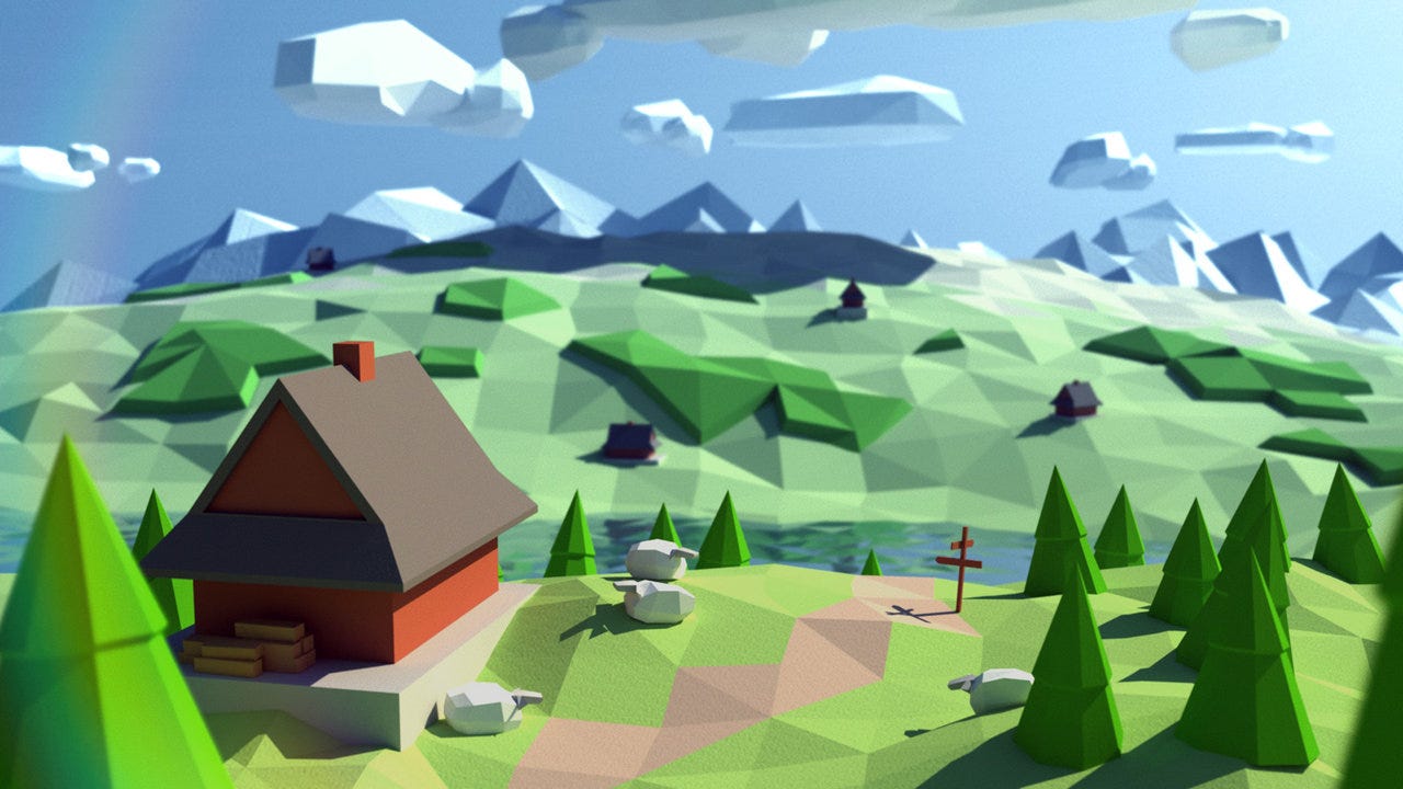
So, I was messing around in blender and studio, and made some low poly terrain! What do you guys think?
(Pictures will also be provided for those who don’t want to play roblox right now.)
So, I was messing around in blender and studio, and made some low poly terrain! What do you guys think?
(Pictures will also be provided for those who don’t want to play roblox right now.)
Feedback
Honestly, the terrain present resembles the art-style of “Cartoon” much more than something you could describe to be “low-poly”. I say this because the word “low-poly” is an adjective specifically used to describe assets with a low amount of polygons, which are usually represented through triangles. Here is an example of low-poly terrain. Despite the low amount of polygons, there is a clear sense of depth and detail to a degree. Your terrain is simple too flat. Either way, it is a good start and you have made great terrain in general. Though I personally would not describe it to be low-poly.
Here is a Blender Specific Tutorial regarding low-poly creations. This features the creation of low-poly terrain so I highly suggest you view this.
Yeah, I realized it was more of a cartoonish terrain. Also, I was going for more of a border, and I made this really quickly. Thanks for the feedback!
It looks pretty good tbh, but if you could change the texture of the meshes, then it would look even better.
It depends really what you’re designing the terrain to be for. Right now it’s quite a cartoonish look so if you’re going for that vibe then you’ve smashed it!
Yeah, that’s what I was going for with this.
I like it a lot, tho I think the colors could be brighter.
Always loved lowpoly terrain like this, I would say though make more variations of them instead of just one that you re-size and what not, also change the colors as they look a bit of a dark green color, try going for a brighter color in my opinion, you could possibly go for a more brownish color instead of having it more of a lighter color however you could keep it like this with the plastic low poly vibe you going for.
Add different types of mountain. By this I mean different rocks that are different colors and possibly different shapes. I think this could add some more detail to help improve the build.
Overall, for your first one this is a very nice unit of building.
There’s nothing to make a strong opinion on, so I’m going to say so far it’s good.
However, this isn’t low-poly, it’s more of a cartoon style build.
The terrain is too flat, add more geometry to the mountains.I don’t like the colors that you used for the terrain, they are too dark. Maybe use lighter color. And don’t copy and paste the same mesh everywhere, add more variation. Also improve the lighting.
I’m gonna add some rocks and trees to this build, but I’m gonna darken the color of the baseplate, because while yes, I’m going for a cartoony vibe for this, I don’t like bright colors. So, I’m going to darken the colors. Your right about the fact that I do need some more variety in the mountain meshes, yeah, but I really liked this mesh over all the past attempts. (Lets just say they turned out like doo doo). I’ll continue working on this cartoonish place, and add more variety to stuff. This is my first time using blender to make meshes, and I’m happy on how this turned out.
Hmm, This will be great for a simulator or a hangout game! I love the art and stuff but maybe make the platform to not stick out as much as it is? Make it fit the terrain and maybe make a sun as well, To make it very good shiny amazing game! But good job I like this.


