Hi! I have been working on this police application center for about an hour now, and I personally love the design, but thought it could use a little more, so what do you think?
Also disclaimer; It’s late at night and I rlly didn’t want to script tweens so that’s why there isnt any tweens…
It looks fine to me despite the lack of tweening. Here are a couple of things I would change:
It doesn’t look right though as it’s off center. Try shifting it down and to the left a bit. Be sure to make the application part of the screen larger as it is the primary focus.
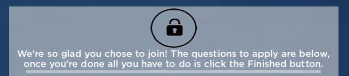
Don’t place something arbitrary like this lock on the screen. The player doesn’t understand what it means. In addition to that, it takes up an awful large amount of space so try moving it somewhere else. The box where the user can actually interact with the form is made smaller because of this.
Increase the size of the area in which the player can interact with the form.
Be sure your TextBoxes don’t clear text when they are clicked. This can make a lot of players frustrated if they’re not filling this application on a Word document.
The Submit button in the bottom right has large text with a bad font choice. Consider lessening the font size and changing the font to make it look better. You can throw in a change of background color for more clarity.
Because this is an application place, you can disable the chat and player list so it looks a lot cleaner.
Thank you for your feedback! I was planning on putting the frame in the center but I wasn’t sure about how it would look with the badge there, I will be sure to try this though!
The lock was just a replacement for what would be the PD Logo, I just didn’t have any on-hand, but I will still move it around and make it smaller.
Thank you for reminding me about the TextBox! I almost forgot about that, as well as the chat/player list. I will also be sure to change the submit button.
Your feedback is appreciated.
The only thing I wanted to add that Qxest didn’t mention is that the badge on the left looks a bit too detailed compared to the background. Looks a bit like how old games would include real-life imagery for realism, but just made it look weird. Try finding a vector image or making a badge yourself.
I took the best badge I could find off the googlez images, and that is what I found because I can’t photoshop at all. As for vector images, no idea what those are…
Vector images are images made out of functions instead of pixels. They are almost always used for logos as they can be easily scaled without losing quality, which is also the main reason I proposed this as you are trying to import a free image which could be 200x200 or even 2000x2000 and vectors allow you to choose whatever size you want.