Just built this wanting some feedback on it.
Overall, it looks good.
The stairs look a little awkward to me. You could try lowering the house itself so the stairs don’t have to go down as far, or you could try a new stair design. Good build.
A rocking chair or any nice decor on the porch would fit in great!
Front looks great. Back and sides could use more detail (windows?)
The structure and details look nice however I think the side of the roof should also have blue parts going up it. An example is…

Before ^

After ^
Me personally I think it would look better that way but its based on what you like 
It would be much better if your house had an interior. The fact that you’ve used a quite reflective blue glass for the doors and windows – especially in such small panes – degrades the rest of the built and gives it an unwanted comicality. This could be much avoided (and improved) by having a decent interior instead.
There are some problems with the columns of the house regarding…

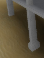
The fact that the left column has no base.

The fact that there are more columns for the stairs than for the house. Again, it makes the whole thing look unrealistic. Add more detail to the columns themselves, such as wood joining them together, and put some where the veranda meets the house itself.
Everything else is good.
It looks pretty good, but on the last image, the beam to the left, doesn’t have support on the bottom of it. Over all, looks really good. Good job! ![]()
The stairs seem very long. Shorten them down a bit.
Also add some more windows to the side of the house. Look up some beach houses and get some inspiration
Add some windows around the house and it would look even greater. You can add some extra decoration and detail by making a table with some chairs maybe. The stairs lot of collumns and they are too big. Size them smaller, maybe try wood as material for it.
Good job tho. Keep improving from our feedback!


