Any tips on how i could make this better? How do I make it less boring and more alive? This is my second attempt to redo my whole town and I don’t want to redo it again so please please please be harsh. Thank you
3 Likes
Try looking at some real life references, and get all the details from it.
Right now, I can see you have the major “elements” of a bait and tackle shop.
- The wedge things on the top roof overhang
- The cover above the entrance with a sign
- Recessed porch/entrance
- White outline/trim
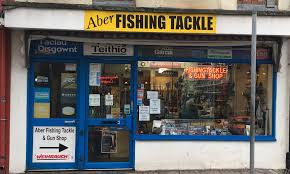
Now let’s look at some photos I got from a google search. I just searched “bait and tackle shop exterior”:

What I see:
- Lots of signs! Really gives off the look.
- An ice dispenser thing. Could help make the entrance look more complete.
- The wall trim seems to be in half for the ground floor, then full for the upper floor. Consider making the planks vertical on the ground and horizontal for the rest?
- This might be just me, I feel that the wall/window/door trim might be a little too thick and throws off the balance of the build overall.
That’s just some personal feedback and how I’d go about it, others may have better input!
1 Like
I’d say possibly change the sign. The font doesn’t pop out and overall makes it look bland. Could also try experimenting with a different building shape and moving away from using exclusively 90° angles everywhere.
2 Likes
This build looks good. I would add more lighting, and add some decorations in the front of the store like ice boxes and other items.
1 Like


