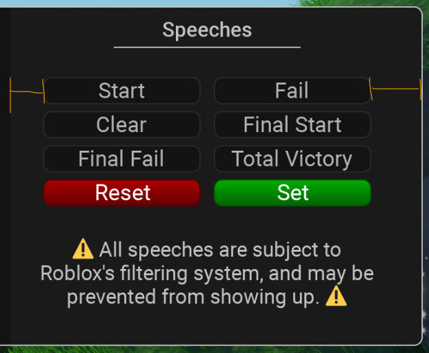
How could I improve this Ui? There isn’t much else I can add and I’m blanking at the moment, anything I could do to fill up the blank space?

Not really much, you could try to just space the buttons out more unless if you want them to be like that
1 Like