What do you guys think? Comments and critiques are welcome!
Looks amazing! The scenario is detailed & polished and the poses seem dynamic & fun.
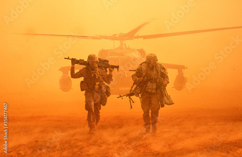
The only suggestion I’d make would be to increase the contrast since the characters blend too much into the background and they are the main focus. If you check the references provided, especially the fourth image, you can see that the soldiers look very dark in contrast to the light brown sand color and you can tell them apart, so you could add this to your GFX.
This looks very good! I like this GFX’s graphics, lighting, style, and background!
I suggest making the gun barrel a bit shorter since it looks pretty long and a bit bigger than the Roblox characters.
where did you make that design? blender?
I use Blender and Photoshop to make GFX.
It looks amazing, Its just the tint, Don’t mean to be gross but it kinda looks like someone urinated it. But I love the way you posed the rigs, How did you model the 3D Clothing? I’d like to use something like that for my GFX Art.
Looks like a sun flair on a antique color change, sarerated.
The 1st version I like more. Makes it look dusty. I’d raze it up a bit to get that gun tip and a buffer from the edge. You have some room to play with on the bottom. Just tilt up a bit.
This looks absolutely amazing. I am not experienced with GFX much but I absolutely love this one that you did. I would love to see more of your work!
I dropped it in the toilet, oops
I believe the “urinated” tint you’re talking about is the high saturation.
Here’s what it looks like with lowered saturation:
As for 3D clothing, there are a few tutorials on Youtube about it (DM me if you can’t find any).
Ok that makes sense, Thanks for explaining.


