I’m currently finishing up my game to release it soon aaannndd of course I need and icon for my game.
This is it:

But I’m not sure if it’s good (probally not).
Any feedback?
Edit:
Currently it looks:
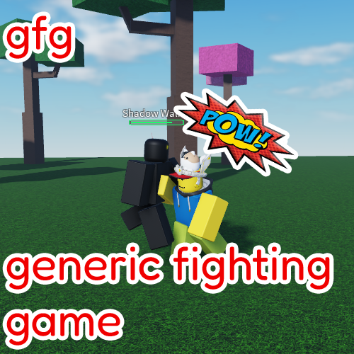
I’m currently finishing up my game to release it soon aaannndd of course I need and icon for my game.
This is it:
But I’m not sure if it’s good (probally not).
Any feedback?
Edit:
Currently it looks:
it’s a good try but you could try to do more than putting onomatopoeia and the title of the game. for me i would just add more contrast with the game’s title and the game preview because it might be too much to look at imo.
The icon looks good, try to make the logo a bit thicker and add some “anime” affects all around the icon to make it look like there’s action.
It’s pretty good, and I like the style, but I have one suggestion. You should make the character fighting the enemy larger and the main focus of the icon. You don’t want too much of the background to be in the icon because it takes away from the main premise. Roblox game icons are very small, so many details are hard to see.
It’s fine, and I agree with @Awyrbot’s feedback. You have to prioritize visibility in a game’s icon mainly because it’s small.
I’d like to add a bit more. Since you’re dealing with an icon, consider changing the text. You have to choose between removing one of the red texts. Keeping the “gfg” text and removing “generic fighting game” or vice versa. I think having both of them is unnecessary. You either go for the shorter one, keeping the icon simple and uncluttered or keep the longer one for people to read and know what the game is about. Or maybe, you can make a recognizable logo for the game and replace the “gfg” text as a whole. Keep the “POW!” one, it’s good together with the background.
Absolutely this. When you scale the icon down to something like 150x150 (which is what icons are scaled down to on the roblox site), it becomes very hard to see the subject of the icon:
serious improvement is needed
so first off, your text is hwat needs most improvemnt. basically, it has no character. it is… generic
i suggest going into photopea, taking some random bold font and using that to create your logo with curvature, deformation, color, etc. next up, gfx
gfx: that background image is just no
hop into blender have two ultimate rigs and pose it properly, because your posing is off, your landscaping as well, (baseplate with trees? maybe add mountains in deepwoken lower erisia style)
the trees are really nice tho
also lighting like this lighting is mid ngl
ok then your onomatopioea pow thing is just weirdly standing out, have it in same font as logo text
