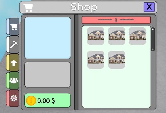
Sorry if I am a little late but I think this is a great first attempt at a GUI, mine was much worse.
I would like to point out that the tweenservice you are using on the GUI is wonderful and I could honestly sit there all day and play with it
First, if you are going for a cleaner style, I would recommend creating a background frame to encompass the UI. This will make the UI look held together and cleaner. When doing this, I would probably go for a dark gray, slightly transparent background and use this plugin on it to make it round, which will also help with a clean look https://www.roblox.com/library/2233768483/Roundify
If you like that, I would also section up the martial arts names under one of these to make it stand out more and feel more connected.

VS

Second, I would try playing around with the border thicknesses of the rectangles. Generally, I would make smaller border thicknesses for the smaller or closer or more detailed stuff. This would add a bit of depth to make it pop out more. Not sure if this would bet he best on this certain UI but it may help
Third, try using not just 2 colors, a black border and a white background. You should use more grays in the design to make it have a little less contrast. If you do this, you should also contemplate changing the font color. Also if you look at the images I had earlier, a little color can really change the way a UI looks. I think if you changed the background behind the martial arts names to really light colors, like I did with the side options, it would look much better.
Fourth, the text could be a little neater. For a clean look I would recommend making the text slightly smaller but then adding a textstroke to it that is a different color than the text to make it stand out more.
Fifth and finally, adding a little transparency to the different elements, especially if you are using my first suggestion, can go a long way.
Thanks for listening to my two cents and goodluck!


