Any idea on how I could improve these GUIs or is everything good?
Any idea on how I could improve these GUIs or is everything good?
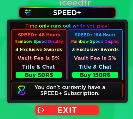
Overall 5.5/10
(limit)(limit)(limit)
I like the red and blue parts, they look nice. I’m not sure about the rainbow though. While the background does also look nice, the border and icons/text is a little too saturated compared to everything else.
The brighter portions in the top of the coloured text doesn’t look that nice.

It gives it a less modern feel, similarly to the gradients on these buttons.
(Or it could just be the text)
![]()
Other than that, the UI looks stunning. I’ve made a really good semi-functional UI system recently, but it wouldn’t look as nice as this.
Try messing a little more with the gradients on those. I’d rate this a 8/10.
Thanks for the feedback, I’ll make the appropriate changes now. 
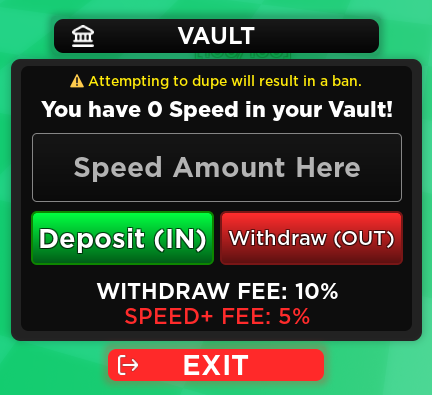
Think this is better? I changed quite a lot of the layout.

Not exactly a fan of emojis, but yes, that looks much better!
If possible, you can get rid of the text under “Deposit” and “Withdraw” and replace it with a prompt by the cursor that tells you what it does when you hover over it, or maybe just a confirmation window that tells you what it does.