Looking for feedback on my simple healthbar gui. What do you think i should make the

any suggestions are appreciated! also text fonts/styles.
i have listened to your improvements and this is what i have now.
Looking for feedback on my simple healthbar gui. What do you think i should make the
any suggestions are appreciated! also text fonts/styles.
i have listened to your improvements and this is what i have now.
oh and what colour should I change the text to (the 20/20 text) because when the health bar gets to low it looks like this:
Try doing white text, green hp bar, and white outline, and keep the color behind the health bar and the text black.
Either white text, or display the health on top
Heck, you can even go with percentage
i don’t know if i like it. full health
You should keep the background/empty part of the health black.
Instead, you could add a stroke to your text to make it pop out more (TextStrokeColor3 and TextStrokeTransparency).
You should also add one to your border with a UIStroke instance.
Maybe make the green less harsh? By that I mean making it darker or something more calm to the eyes. I think you should also add a gradient to the green part so it’s more smooth.
Finally, and probably something really important; right now, your health bar leaves the dark outline with an unequal spacing in between it. Make it equal please!

is this better?
This is what I mean; the width has more spacing then the height.
Also, add a UIStroke to the border.
If you don’t like the text, try swapping out the colors (Black becomes the outline and white becomes the text)
Edit: Still doesn’t seem exactly equal.
a white uistroke? or what colour? its hard to get it exactly equal because for my script to work i need to have the anchor point at 0,0
White UIStroke, yes, but feel free to experiment.
For the equal part, the best way is to use these little yellow things (I don’t know what their actual name is) and make sure that both numbers are equal or close.
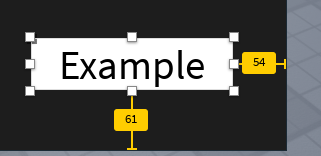
ah ok i was wondering how you were getting such precise measuring i will try that. edit im not sure you can use the yellow things when the gui is in a bill board gui
Oh, right, sorry about that. I think you should be able to move the UI to a ScreenGUI in StarterGui (That’s a lotta GUI in one sentence!) to edit it there.
You’re probably using scale.
Well, last ditch effort, you might want to try to manually set some numbers until it seems equal. Only if you want to do that, though. It’s not fun…
ok might see you in a couple of hours
lol
New and improved health bar what do you guys think?

I like it, I think you could use a UIGradient to give it more depth. Apart from that, good job!
Thank you i appreciate your positive feedback i will try a ui gradient now.


