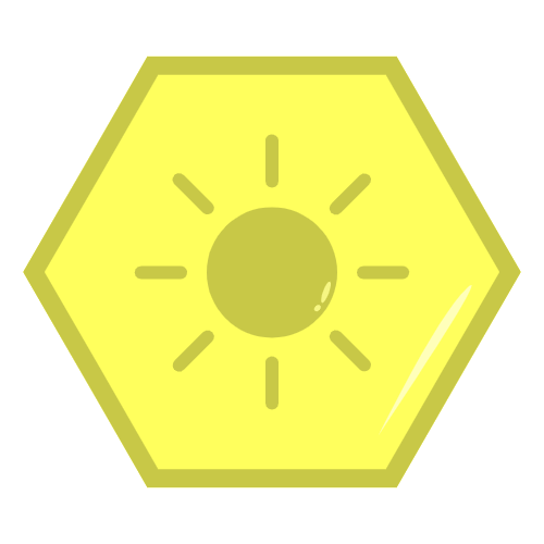
Feedback on my spring, summer, fall, and winter icons.


(The images uploaded sideways)
Feedback on my spring, summer, fall, and winter icons.


(The images uploaded sideways)
I like them and they all follow the same style in a way that kind of flows. The only criticism I have is the autumn logo. It looks quite blocky compared to the others and stands out. If it could become more rounded particularly at the base I think it would look much better.
Overall, not bad.