Hey, thank you for coming to help id just like some tips or pointers on how i could improve my work! thank you again!
I can’t really see anything to improve on everything seems very professional.
The first one is nice and seems you got all the materials right. Poses are really weird and the lasers flying across are very unusual as well. For the second one, the light saber could have been more detailed as well as the character to reflect dirt/grunge on the armor. The effects are kind of all over the place as well similar to the first one. Overall not bad though.Third one follows a similar pattern, the renders are all very nice but the effects seem not to fit in for some parts of your work.
Alright thank you! will be sure to try and do better in that respect!
The other too graphic designs looks good however the gun effects look a little weird looking you should include something firing in the air like a jet or tank place them in a more interesting way to look more realistic.
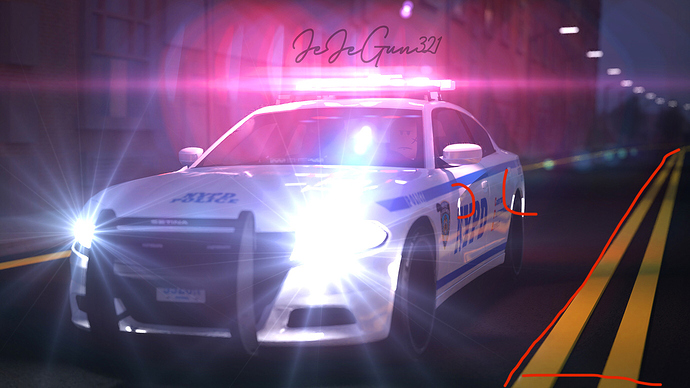
The image shows a red lighting with shadows coming of the car it almost looks like it’s glowing and casting on the entire street i find the white glowing objects on the side of the car look unappealing you should perhaps add street lights. I find yours is a little to bright since it’s casting lighting effects on the side of the car, double yellow line…
Overall. The scene looks good it captures that realistic approach but the area looks dull and bland include objects so it doesn’t look like a abandoned town. - city area.
Look great, I have a question, how do you add a high quality background like the first gfx or the last one ?
Thank you so much all them points make complete sense and i agree entirely!
I do it in post in photoshop! drawing or a picture ect
Quality renders and edits. Looks very realistic


