Hello, I just got back my motivation to make clothes again and I improved my group logo, roles ect… I would love feedback about my group and clothes and maybe tips to make it better ? I’m not a pro at all, I’ve been only designing for a year !!
There isn’t a lot of clothes since most of the one I did was for other group that I worked with !
Hey Srnqe here is some feedback for your group and clothing.
Group Feedback
Okay so starting of on your group, overall it seems to be made to a good standard with a short and simple name and a good description. However there is two things I wish to comment on.
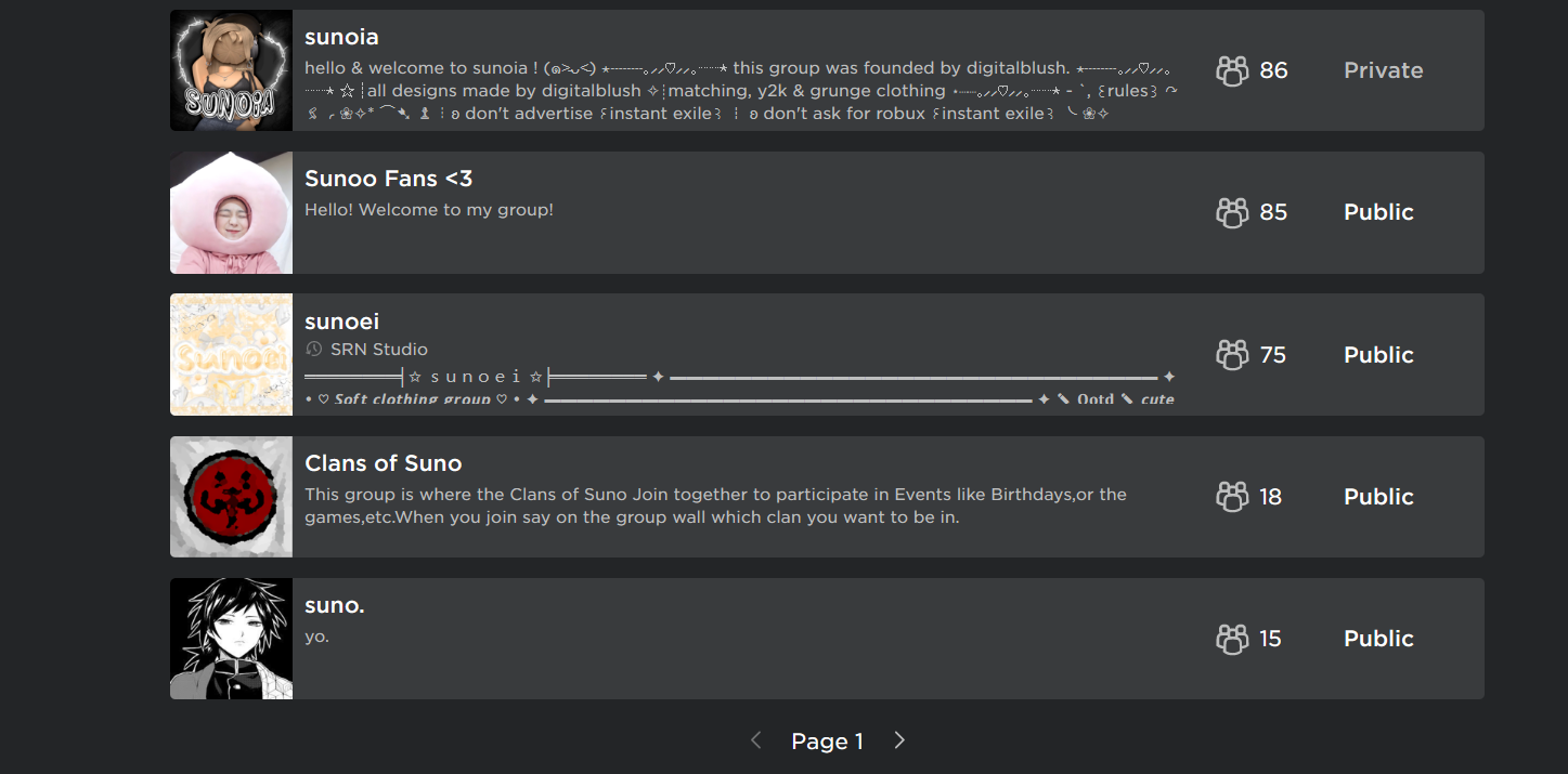
Now i don’t like the icon personally due to the text and colour pallet as I believe you should avoid text when making an icon especially for a group, This is largely because when you are in a standard screen the icon may look messy as the icon is not very big as shown below:
This is fine and you can see the text clearly however personally I do think the colour scheme is a bit to similar throughout most notably for the text as i believe its to similar to the background colour and it may work nicer if the background and text colour were darker but they are in my opinion to vibrant to be that similar with only white separating it.
In Search
As seen below when compared for example to sunoia that most likely even though it has text will be more appealing simply due to the fact is shows a piece of clothing when compared to your icon which is fairly basic, mostly the same colour and fairly boring.
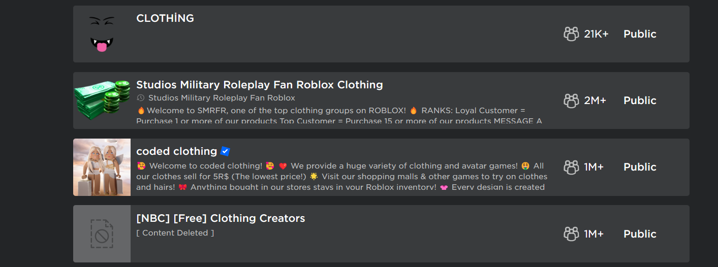
An example which i like is for coded clothing which has no text but shows some of the groups product which in my opinion will make a potential customer more likely to click.
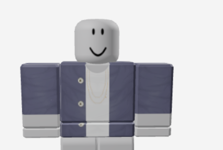
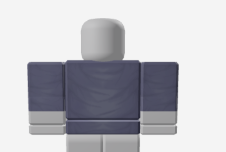
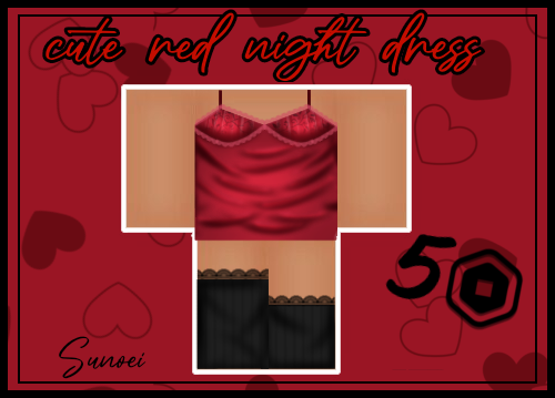
Personally I think the clothing is alright, it has an audience and its of reasonable quality except of course I do have something to comment on about it concerning the shading. I have noticed while you have largely stuck to the edges I don’t believe the placement is the best way in which is could have been done and I will quickly make a shirt to show you what I mean…
Okay so first note for this shirt I used 3 separate shading templates and my first note is: Use shading templates. You don’t have to fully copy them and I advise against that but I think its a massive help to put them on a blank page and just edit them, drag some of the lines about, change the contrasts, vibrancy, colour, blur hell even add a mosaic pattern if you want and just generally make it your own to fit your style and if you really want to mess about edit them around for hours and save a bunch of different ones so if you ever make a t-shirt for example you will already have a few shading templates you can use, if you want to make a jacket you will already have a few shading templates you can use. Shading templates are there so use them and save yourself a lot of time and effort. If you even want to commission a professional standard clothing designer to make a bunch of shading templates for you then do it as It will be beneficial long term to not just have the skills to make it but to use existing resources and modifying them which will allow you to focus on other aspects of creating clothing.
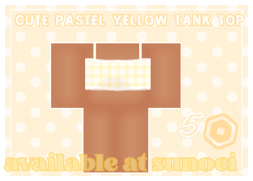
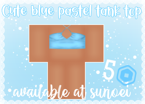
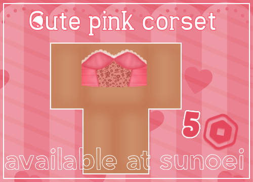
Final piece of feedback: More clothes. Outfits. Outfits are incredible. Specifically make a shirt and pants which go together and if its good enough people will buy the outfit.
Thank you so much ! I definitely have trouble with shading and I will change the group icon ! This really help a lot and I will try my very best to make everything better !