Could we have feedback on our icon, because it doesn’t seem to be very attractive.
OLD:

v1:

v2:

v2.5
Could we have feedback on our icon, because it doesn’t seem to be very attractive.
OLD:
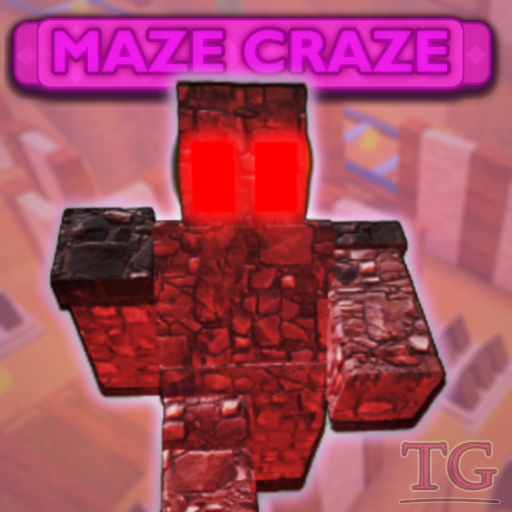
v1:
v2:
v2.5
The icon is great, but it’s lacking effects. And maybe the character’s color in the icon can be a bit brighter. But good job on it!
The text seems more than okay to my eye, other than that you could maybe remove the green-ish outline effect that looks weird
Looks pretty cool, but from my view(This message isn’t intended to be mean or anything, it’s just my personal opinion):
just like what you said, it isn’t very attractive, well for one, the bottom part is very messy, to have a clearer picture of what I mean, let me show you it in B&W:
Other than that, overall I think the thumbnail works, but I do think it looks a bit…Generic, it’s not bad to be generic, but people would usually click on stuff that sticks out. I really like this icon, and I can’t wait to play you and the others (You and the other people from the “us”) game.
How do we make our icon not generic, because that wasn’t our goal or our intentions.
The background doesnt fit maybe a bit darker and blur also match the color
How can we make it match the color? There are various different colors, and it’s hard to know what color to switch it to.
You could give the background a purple/red tint, so the it matches colors with the text or the character.
Ok, I’ll try applying that right now! Thanks!
Just updated the topic with the altered icon with all of the feedback that was given. Please give new feedback, or tell me if we succeeded in making a better icon.
It looks better, but I think it could still use a little improvement.
The font used for the logo, which if I recall correctly, is called Luckiest Guy, seems generic and overused in my opinion.
It’s important to keep in mind that whichever font is used in a logo should correspond with the aesthetic of the game. For example, if someone is making a game with a cartoony aesthetic, they should use a cartoony font, like Fredoka One or Passion One. If they are creating a sci-fi game, they could use a font like Orbitron or Starcruiser.
So, what is the aesthetic of your game? Is it low-poly and cartoony, or is mid-poly and semi-realistic? And what is the task in the game?
Conclusion:
Just updated the icon yet again. Feedback?
We have now fixed this issue. Is there any feedback you have left to give?
Not really, looking forward to your game though.
Thanks! Here’s the topic that has our game, if you’re curious: People leaving game really early on