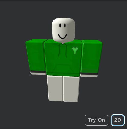
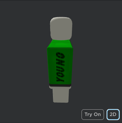
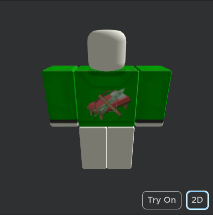
So I’ve recently been working on making a few shirts for me to use while I’m playing bedwars and I’ve came up with multiple designs but I’m not feeling 100% happy with my design. Which is why I need feedback on my shirt. Some info: “YOUNG” stands for the start of my username, “Y” stands for “YOUNG”
Here are some images of the shirt

All suggestions/feedback are appreciated!
Thanks
(Here is the link of the shirt in case you want a better look at it)
5 Likes
That’s really cool! I’m not a clothing designer myself but I do have one suggestion. Maybe you could make the ‘Y’ be the same font as the ‘YOUNG’. That way, it’s a bit clearer what it stands for?
Nice work, though! 
2 Likes
It looks good! You should make pants for this hoodie too!
4 Likes
Thanks for the suggestion! I will try to incorporate that into the shirt to make it look better
2 Likes
not bad! the texture used on the hoodie feels nice and helps make it feel like an actual hoodie :]
i noticed the cuffs on the hoodie are black. have you thought about making the hood part itself also black, to match with the cuffs? i think it would really look nice!
the icon on the back of the hoodie seems a bit offcenter, i’d suggest moving it to the left a little. same with YOUNG on the right arm, seems a smidge offcenter.
2 Likes
Thanks for the suggestions!
To answer this, I have made a black one, yes
Also, I will try to get everything centered so it looks better, thanks once again!
3 Likes
