Please give some feedback!
4 Likes
The text would look better if it was outlined similiar to this
Also his hands really look odd. The noob looks like he’s just holding the sides, when it should look like this.

He seems to be doing a “turning” tilt. But nothing has been tilted. He’s not standing still because his feet isn’t on the ground. So it just looks as if he’s falling.
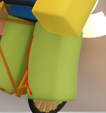
The wheels are passing through the floor

The background could be more interesting. For example, a forest? A seashore?
The head would look better tilted upwards.

The leg here also looks very odd, And not even where the pedal is.
I understand this is a test GFX, but this could just look better in general.
1 Like

yeah had some limitations with the leg because the modeled (witch I made) is too much like a real bike and hard to position the character on.
2 Likes


