Hi, guys,
I wanted to know your opinion about the ui I made.
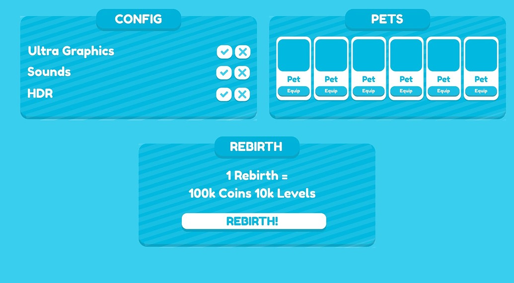
The name is Blue Cute UI, it has a light blue tone with white stripes.
It is also more simulator oriented.

Hi, guys,
I wanted to know your opinion about the ui I made.
The name is Blue Cute UI, it has a light blue tone with white stripes.
It is also more simulator oriented.
No watermark 
But yeah it looks nice.
The only thing i would change is the “Click” text in the click button, cli is separated from ck.
I did it in seconds lol
I didn’t even want it to be stolen either, if you want to take it
It looks very nice!
Very bright, sitting in the dark right now lol
But, other than my blindness that was caused by the bright blue, it’s great!
On the button that says “Click” and the button that says “Config.” I’d mess with the font size a bit so it fits since it’s separated. It doesn’t look too good like that.
Other than that, love it!
Keep up your good work!
I actually prefer the seperated ‘cli’ and ‘ck’, I think it gives personality to the design. However, I think in the future, @GustavoVendramineHF should choose a word with two syllables. Otherwise, it’s great!