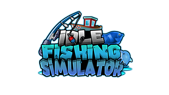
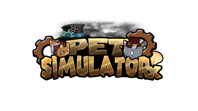
I’m currently creating logo concepts to get my experience better and better, just need some feedback and thoughts if anything should be changed or fixed on these concepts.
5 Likes
Looks really good altogether! I will say though that the first one looks a bit flat with the graphics in comparison to the bulging text.
1 Like


