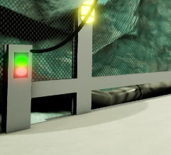
Heya! I made another underground cave, tell me what you think!
3 Likes
I dont really like this colour, it looks ugly to me.

Also the metal bars here dont really match with the rocks in the background, you should change that

6/10 i like it
1 Like
its alright but I am surprised how you would get that almost toothpaste colour underground when the most of the lights have a yellow light also I think you could turn down the amount of brightness in the neon lights which u do by turning down its saturation a bit other then that looks cool I give it a 6/10

