
FreeStyle Manager Plugin
Download Plugin | Download Example Place
What is it?
The FreeStyle Manager is a Roblox Studio plugin designed to streamline the process of managing and applying UI styles across your experience(s). Inspired by tools like React Lua and Fusion, this plugin was created to provide an easier way to create reusable UI components without the complexities of building everything in code and states-management.
Who is it for?
This plugin is ideal for:
- Visual-first Developers: Developers who prefer building UIs in the visual editor but want to streamline the process with reusable styles and components.
- Consistency Enthusiasts: Developers looking to maintain consistent UI styling across their project while easily updating styles across all their UIs.
- Multi-Experience Designers: Developers who want to reuse the same UI structure and functionality between multiple experiences but with different visual styles.
Key Features
1. Visual Editor Compatible:
- No need to build your UI structure in code.
- Designed for developers and UI designers accustomed to tools like Figma or Roblox’s visual editor.
- Allows you to visually design UI layouts while enabling advanced styling and reusability through scripts.
2. Simple to Use:
- Requires only basic Lua knowledge.
- Focuses on providing an intuitive workflow for all skill levels.
3. Flexible Styling Options:
- Supports deep inheritance of styles, allowing child styles to inherit from parents.
- Easily apply objects like
UICorner,UIStroke,UIGradient, andUIPadding.
4. Manual and Live Updates:
- Manual Updates: Apply styles on demand with the click of a button.
-
Live Updates: Automatically detect changes in the stylesheet and apply them in real time.
5. Wireframe Mode:
- Toggle a clean, minimalistic wireframe view of your GUI.
- Ideal for creating layouts and ensuring good alignments and layering.


How to Use the FreeStyle Manager Plugin (with an example)
The example modal (Download here):

1. Install the Plugin
-
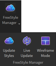
Download and install the plugin into your Roblox Studio environment.
The plugin should look like this :

2. Add a Stylesheet
- Create a
ModuleScriptnamedFreeStyleSheetinReplicatedStorage. This script acts as your central repository for all UI styles.
Here is how it looks for this project :
-- FreeStyleSheet
local Components = script.Components

local BackgroundComponenents = require(Components.BackgroundComponenents)
local ButtonComponenents = require(Components.ButtonComponenents)
local TextComponenents = require(Components.TextComponenents)


local Stylesheet = {
	Background = BackgroundComponenents,
	Button = ButtonComponenents,
	Text = TextComponenents
}

return Stylesheet
To keep it clean, you should only have your components in this file.
3. Structure Your Project
Here, how this project is structured. However, you don’t have to replicate it, exactly.
I divided my ModuleScripts into two folders. One for the components with which I build the UIs and another folder with the styles that I use to build the components.

4. Creating styles
Here is an example of my colors styles :
local Colors = {
	Primary = {
		Light = Color3.fromRGB(37, 233, 255),
		MidLight = Color3.fromRGB(59, 52, 255),
		Mid = Color3.fromRGB(69, 119, 172),
		Dark = Color3.fromRGB(133, 111, 255),
	},
	Secondary = {
		Light = Color3.fromRGB(251, 255, 32),
		MidLight = Color3.fromRGB(255, 207, 32),
		Mid = Color3.fromRGB(122, 105, 36),
		Dark = Color3.fromRGB(111, 78, 49)
	},

	White = Color3.fromRGB(255, 255, 255),
	Black = Color3.fromRGB(0, 0, 0),
	Green = Color3.fromRGB(17, 89, 33),
	Red = Color3.fromRGB(117, 23, 23),

}

return Colors
Or a simpler one for the Fonts :
local Fonts = {
	Title = Enum.Font.FredokaOne,
	Body = Enum.Font.Oswald,
}

return Fonts
It isn’t shown in those examples, but a style can reference another style file with a requirement.
For example :
local Colors = require(script.Parent.Colors)
local Strokes = {
 StrokeColor = Colors.White
}
5. Creating components
Here is an example of this ButtonComponents with comments to explain each sections :
-- ButtonStyles Module
local Styles = script.Parent.Parent.Styles

-- Requiring all the used styles
local Gradients = require(Styles.Gradients)
local Strokes = require(Styles.Strokes)
local Corners = require(Styles.Corners)
local Paddings = require(Styles.Paddings)
local FX = require(Styles.FX)

-- Creating the Button component
local ButtonStyles = {
--Styling the common proprieties in all buttons
	UIPadding = Paddings.ButtonsPadding,
	AddTags = {FX.ButtonFX},
	UICorner = Corners.SmallCorner,

-- Styling the green and the red button's proprieties that will also inherit from the proprieties above
	GreenButton = {
		UIGradient = Gradients.Green,
		UIStroke = Strokes.SmallStroke.Green
	},
	RedButton = {
		UIGradient = Gradients.Red,
		UIStroke = Strokes.SmallStroke.Red,

--Close Button is a child of Red Button, in which only the UICorner propriety is modified
		CloseButton = {
			UICorner = Corners.Round,
		}
	},
}

return ButtonStyles
6. Apply Components Styles to your UI with Tags
Tag your UI elements to apply styles (and manually refresh the UI):

The first term (in this case “Button”) is the name given in the FreeStyleSheet
local ButtonComponenents = require(Components.ButtonComponenents)
local Stylesheet = {
	Button = ButtonComponenents,
}
The others terms are the one used in the component sheet.
For exemple to style using the Close Button Component shown earlier, the tag would be :
Button.RedButton.CloseButton
Supported Objects and Their Uses
Most the proprieties are optional and will use the default value if left empty
1. UIPadding
- Adds padding (spacing) inside a
GuiObject. - Usage:
UIPadding = {
    PaddingTop = UDim.new(0, 10),
    PaddingBottom = UDim.new(0, 10),
    PaddingLeft = UDim.new(0, 15),
    PaddingRight = UDim.new(0, 15),
}
2. UIGradient
- Adds gradient effects to the background of a
GuiObject. - Usage:
UIGradient = {
    Color = ColorSequence.new{
        ColorSequenceKeypoint.new(0, Color3.fromRGB(255, 0, 0)), -- Red
        ColorSequenceKeypoint.new(1, Color3.fromRGB(0, 0, 255)), -- Blue
    },
    Rotation = 90,  -- Horizontal gradient
}
3. UIStroke
- Adds an outline to
GuiObjects. - Usage:
UIStroke = {
    Thickness = 2,
    Color = Color3.fromRGB(0, 0, 0),
    Transparency = 0.1,
}
4. UICorner
- Rounds the corners of
GuiObjects. - Usage:
UICorner = UDim.new(0, 8) -- 8-pixel radius corners
5. ScaledUICorner
- Dynamically scales corner radius based on the size of the
GuiObject. - Usage:
ScaledUICorner = UDim.new(0, 16) -- Proportional corner radius
6. AddTags
- Adds tags to
GuiObjectsfor animations (will be added later). - Usage:
AddTags = { "ButtonFX", "ModalScaleUpEffect" }
7. RemoveTags
- Removes specific inherited tags from
GuiObjects. - Usage:
RemoveTags = { "ModalScaleUpEffect" }
This was mainly made for my personal use, so, I don’t know, it might not be useful to too many. Nevertheless, I’m happy to share it with the community. Enjoy! 
It is my first plugin, I hope this post isn’t too long and confusing. 
PS; Later, I will probably add the UI animation module that can be used with AddTags to add hover/click effects on buttons and have effects when a Frame visibility change.
Bugs and Future Updates
- Have a way to make TextLabel to be converted from pixel to scale to always have the same height no matter the parent size
- Add the UI Animation module