What do you want to achieve? A good GFX design, as it will be the icon for my group.
What is the issue? I’m wondering if my GFX is good enough or not.
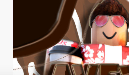
here are some pictures!
**Details/Notes: The cup on the top, is our logo to represent our group. // The main avatar/render is made by a GFX designer, that said credits isn’t needed, but just saying it isn’t mine! **
I have a few things that could be improved in this GFX.
The Background - I’m not sure why but it doesn’t seem to blend very well as shown here, you may want to change it or clear it up a bit.
Random Lines? - I couldn’t tell if this was intended or not but these lines just stick out and don’t look very good. Let me know if they were though!
Corners - You should either continue the pattern here or find something to replace them with, they just stick out a lot and also, don’t look very good in my opinion.
I really hope you use this feedback for whenever you decide to make another GFX! One thing you did very well though was with the text in the middle, beautiful, just blur it a bit so it blends together! I love that glossy effect!
The lighting is not that good. The background is just odd.
The yellow Inner Shadow in the text doesn’t look good.
And rather than having a grey Inner Shadow for the character it’s better to put a matching color or white Outer Glow
However, keep in mind that the icon’s 512x512, so it’s pretty small on the website. If you look at the cafe groups on the website, the logo and person are significantly bigger:
I’d recommend enlarging and bringing down the logo and making it contrast a bit more with the background, it blends in a bit.
Also, I’d suggest bringing the character up front and not having the entire body (the legs) be shown, just the torso, arms, and face are enough. I’d also show him holding the coffee better since it seems to be covered by the text.
The character is way too glossy. Tone it down a bit! Also the lines on the arm just feel weird, so if they’re intended I recommend you make them bigger! Also I recommend the logo gets moved down a bit and make the character hold a coffee or something that brings an idea to the purpose of your group. Good luck with the GFX!