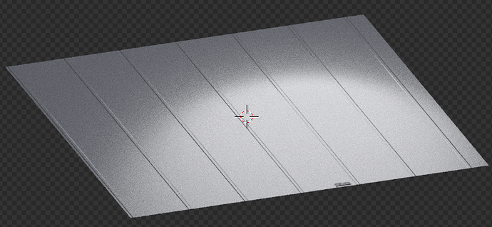
hello developers 1 day ago I discovered the nodes and also how to do more realistic things in blender I want some opinions from you I would like…
This isn’t a lot of information to go on. If you’re looking for feedback on node work, show us the node web, and near, medium, and wide shots that show off your spec and normal maps at different angles, as well as your reference material.
Because all I can say is that it looks ok? There’s a lot of noise in the render so it’s hard to really see it all. But besides that I don’t know what you’re going for in the design ![]()
Check out this thread for a guide on how to ask for feedback ![]()
Looks great for what you have so far, are you using PBR textures? It looks like the bump map is inverted for the diamond plate texture in the second image—you can try reversing the color in Blender and that should flip it in the proper direction. Other than that, it’s a good jumping-off point.
Glad you’ve discovered nodes; they can produce some powerful results. Regarding what you posted though:
For the first image
- The bump map works well with the light; it looks practically like displacement in the grooves. I would reduce the map on the areas outside the grooves (if there is any - I can’t really tell because of the noise)
- I’m not sure if you’re using one or not, but consider trying a specularity map(an image that determines what areas on your mesh will be reflective, and what areas won’t, depending on light and dark areas within the image). From what you posted, it just looks like you’ve got a constant roughness value across the plane, and that usually doesn’t occur in real life since you have imperfections like scratches, hand/fingerprints, dust, etc.
An example of a specularity map and how to use it
Note: To use it, add an image shader, pick the specularity map to be your image, then drag the color output into the roughness input node of whatever you’re using (I assume a glossy shader - see node setup below)

For the second image:

- The bump on the diamondplate really needs to be toned down; it’s too intense as it is. Try to avoid the effect that you have right know where the bump map looks really sharp to the point that we can see individual pixels.
- As for the material on the right, I have honestly no idea what it’s meant to be, or what kind of aesthetic it’s supposed to give off, so I can’t really comment on that aside from the fact that the green doesn’t help.
- You may want to look into displacement for the diamondplate (although you’d need a significant amount of subdivisions for it to look smooth). The reason I say that is because of this:

You can see that the parts of the texture that are in the light catch that light and appear to be 3D, because of the nature of bump (faking protrusions without actually changing the geometry of a mesh - hence why it is non-destructive). Then, once the shadow goes over the texture, it completely loses any semblance of 3D effect and goes back to just being an image texture, because the bump has no light to catch to give off that aesthetic. Displacement usually fixes this, because by definition, it is three dimensional (geometry-changing protrusions of your mesh based on an image - hence why it is destructive). For example, assuming you subdivided enough times, you’d see each individual ‘cut’ so-to-speak have its own indent, even in the shadows.
I made a post about a week ago intended for another blender user to help learn some tricks like displacement and specularity maps; it might help you too (see below).
Overall, it’s a bit hard to give feedback without the node setups themselves, as @Aotrou said. For future reference, please do post images if that if you need some critiques, as it helps to know what you’re doing right and wrong.


