Hey Devs,
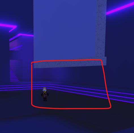
I’m working on my very first game! Ive made half of the game and I need some suggestions and help with how to make my game feel more full. Right now it’s just a skeleton of a completed game. I need to know what I should add and where to place things. I have too many rooms that feel empty that must be filled. This game should end up being a hangout game for people to chat. Please leave your suggestions!
3 Likes
One thing you can definitely add is music. Add some chill/calm music as I think it would fit the game.
You could also change the lighting a little. Add a blur into lighting and set it to 3 or 4. I think it helps the vibe a little bit. You can also use color Correction to make the ambience of the game a little different.
Things you can add to the rooms are: Plants, carpets, paintings, windows, shelves, desks, trash cans, maybe some small coffee tables next to chairs, etc.
Also, I would consider adding a time leaderboard. You can look up a tutorial on YouTube. I think it would encourage people to stay longer.
I definitely agree with your suggestions. I find it quite difficult to find carpets, especially ones that match the game. Would I have to make them? And furniture can be quite difficult to create, and I’m not sure if I should use free models. People might not appreciate that there’s a lot of free models.
Can’t sit on the chairs. Absolute 0/10.
1 Like
Leave a suggestion rather than a hate comment. Ofc you can’t sit, as I mentioned the game isn’t completed.
1 Like
I suggest trying to play with the lighting as right now it doesn’t exactly fit the game, and the interior is just blue light everywhere so there arent any shadows which looks a bit unusual and adds no other colors so there is just a blue tint
The pool that has water in it also has little balls and blocks which i like but maybe make it so you can parkour on them as currently they are too far seperated and if feel like it would add a fun element to the pool
I second this.
Personally, I have a few suggestions to make, mostly revolving around filling it up and maybe adding a bit more detail to it.
Add some bright lights (like spotlights almost) beaming up from under the glass, would give it more of the kind of vibe I feel like you’re shooting for w/ this.
Foliage under this sign is only visible on one side because of decals – I’d recommend putting another decal on the other side.

In conclusion, maybe add some posters to the walls upstairs, more couches or chairs where there is space along the walls, more plants / foliage to make it feel alive, etc.
Thanks you for the suggestion! I should definitely add something to keep players engaged like that parkour idea of yours.
Love that idea about putting lights under the dance floor glass! Thank you!
1 Like

